Imagine AI
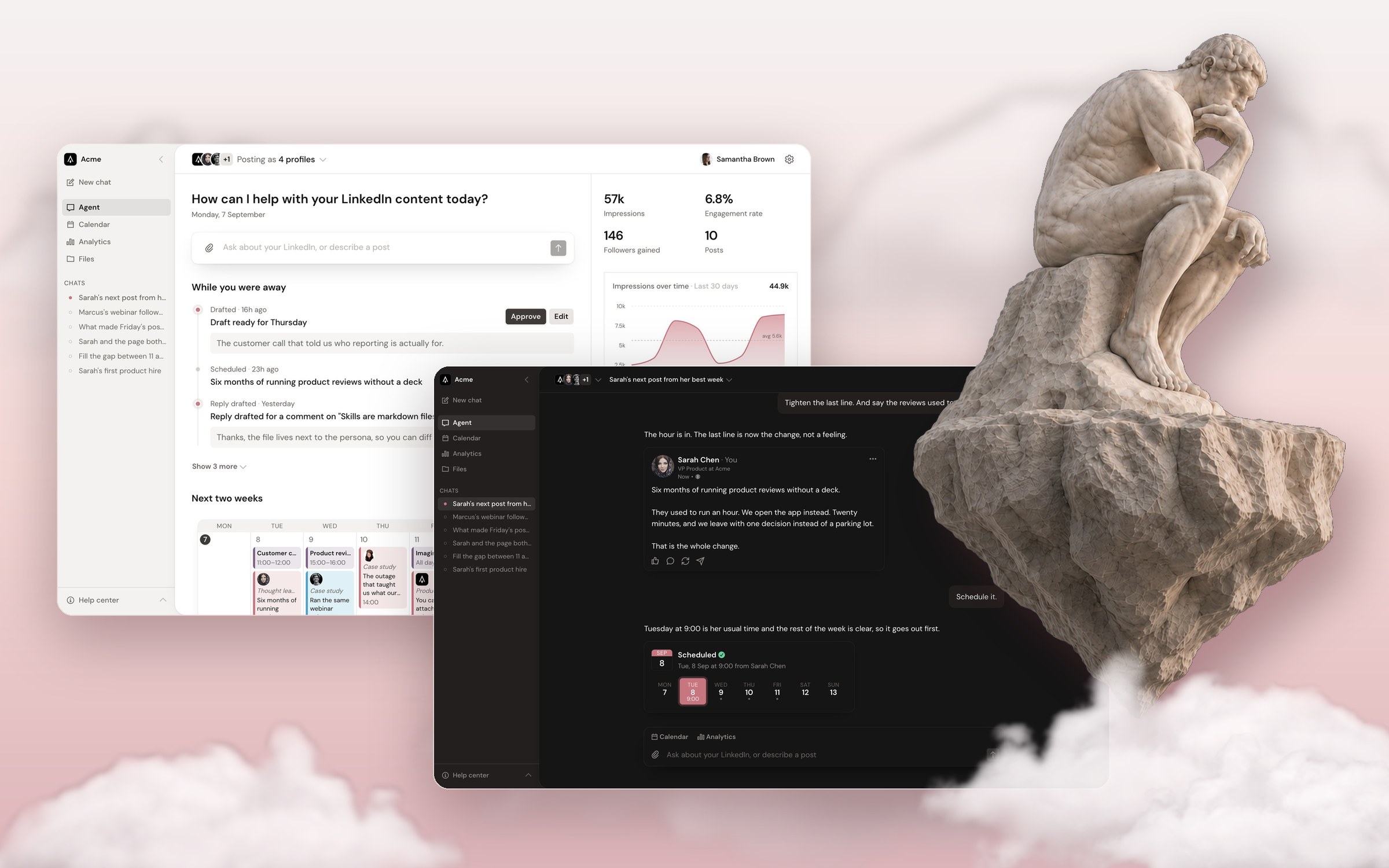
Imagine AI drafts, schedules, and measures LinkedIn content for B2B teams. I redesigned the product around the agent at its core, built the design system behind it, and implemented the new front end in React.
The starting point
Imagine's agent does real work. It drafts posts in each person's voice, schedules them, drafts replies to comments, and ties engagement back to the CRM. The old interface hid all of that behind a dashboard: the agent lived in an “Ask AI” button in the corner, and the home screen opened on totals with no next step.
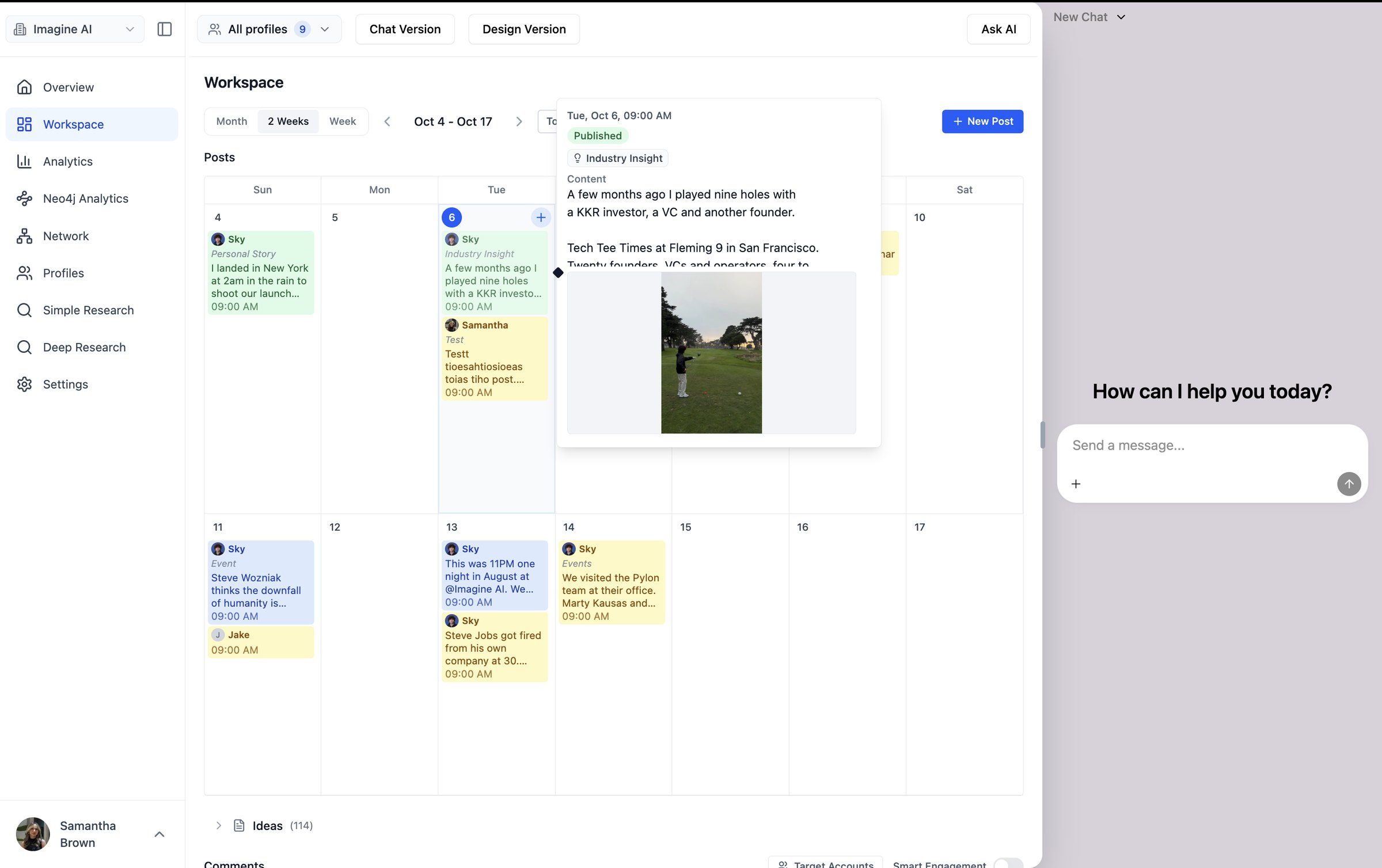
- It looked AI-generated.Saturated default blue on every button and link, generous rounded corners on every card, and cards nested inside cards. That combination is the signature of scaffolded, AI-generated UI. It read as generic SaaS, not as Imagine, and nothing on the screen led the eye.
- Nine destinations.Customer features sat next to internal tools like Neo4j Analytics and two separate research modes.
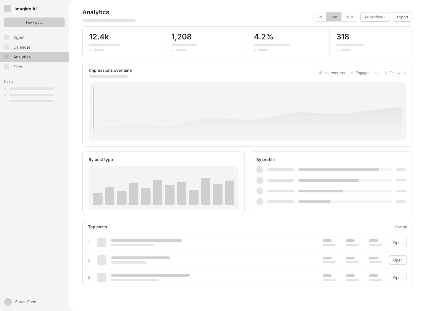
- Numbers without a next step.Team feedback on analytics was blunt: the UI is unclear on “what do I do with this?”
- Unfinished edges.Destructive actions used the browser's native confirm dialog instead of designed confirmation UI.
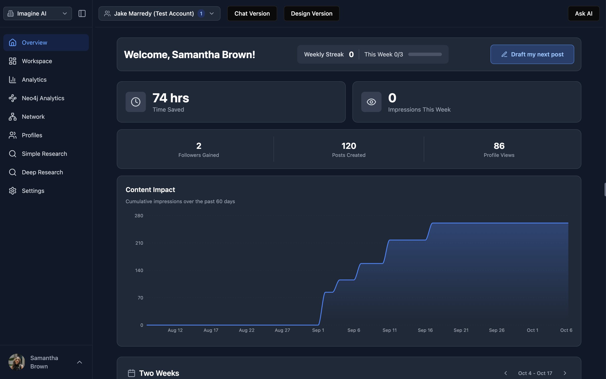
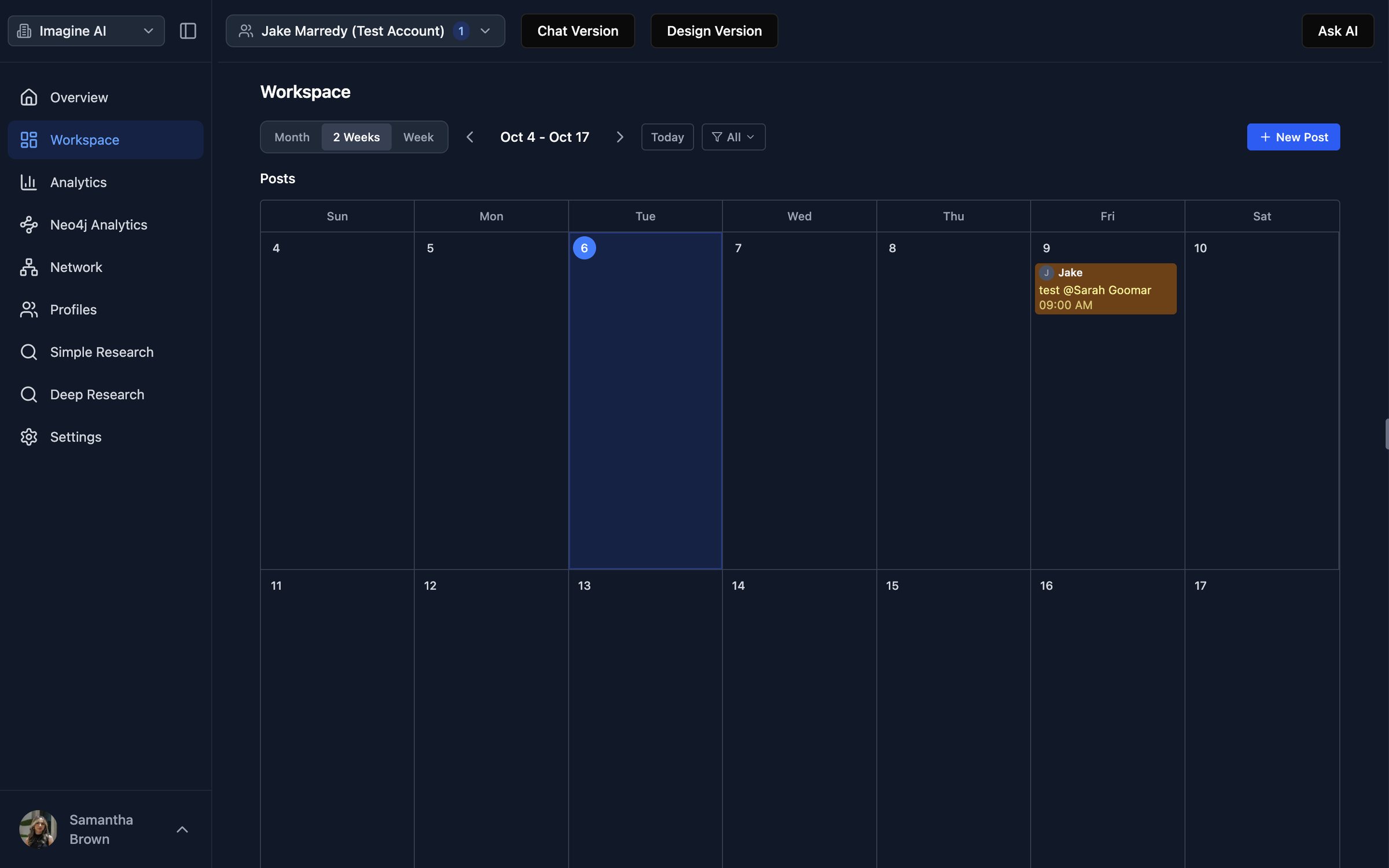
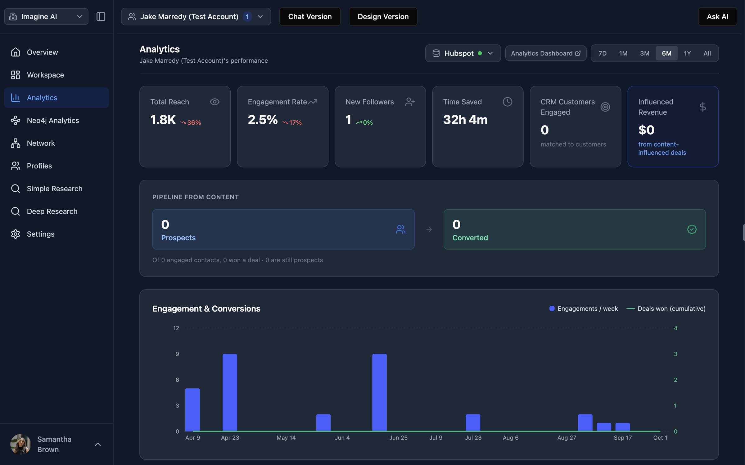
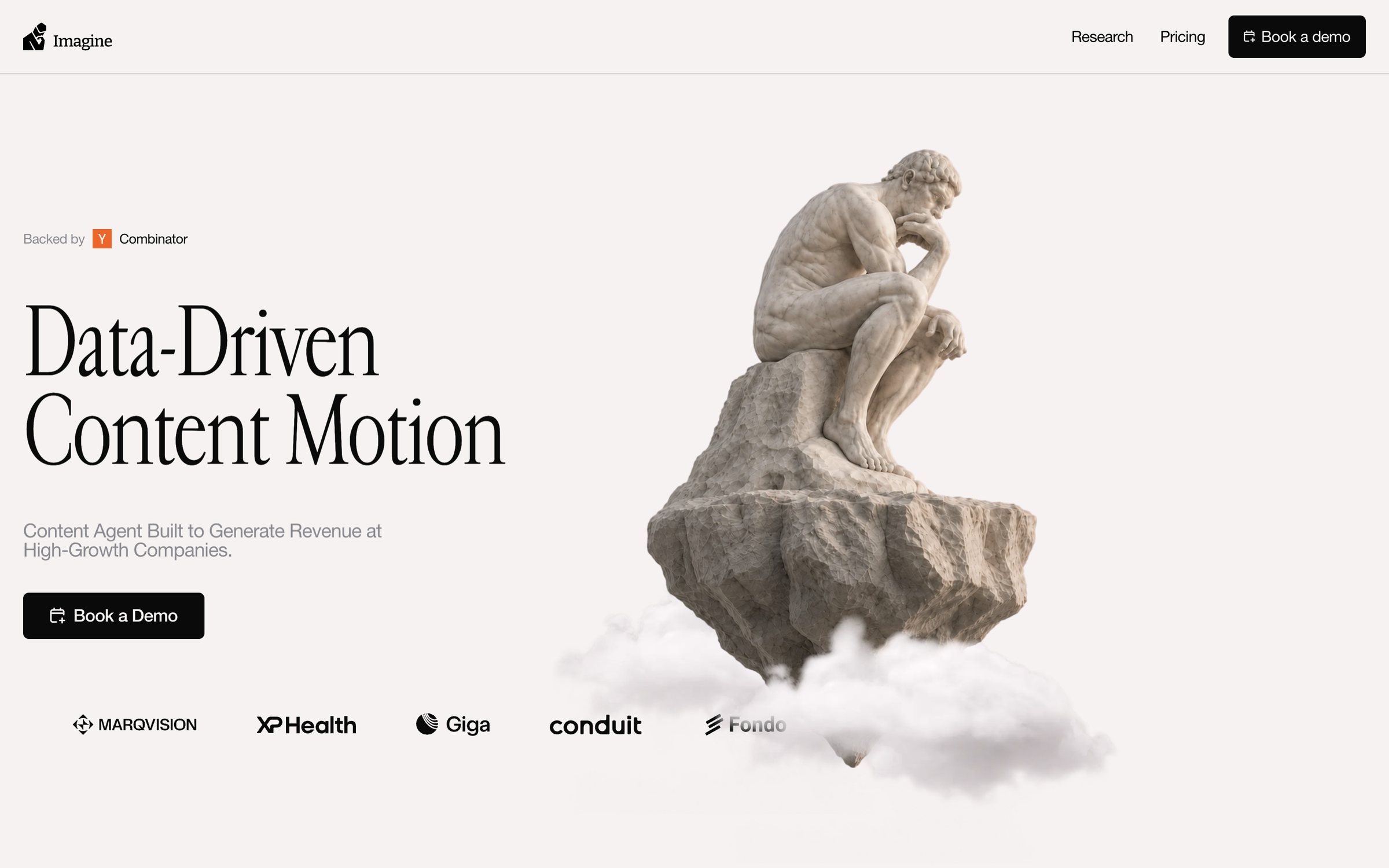
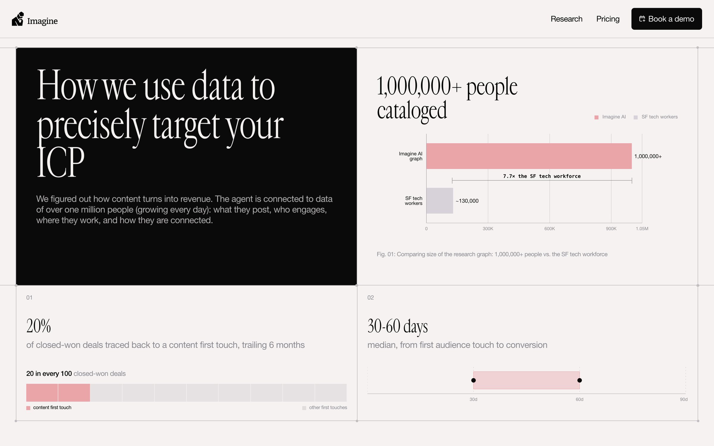
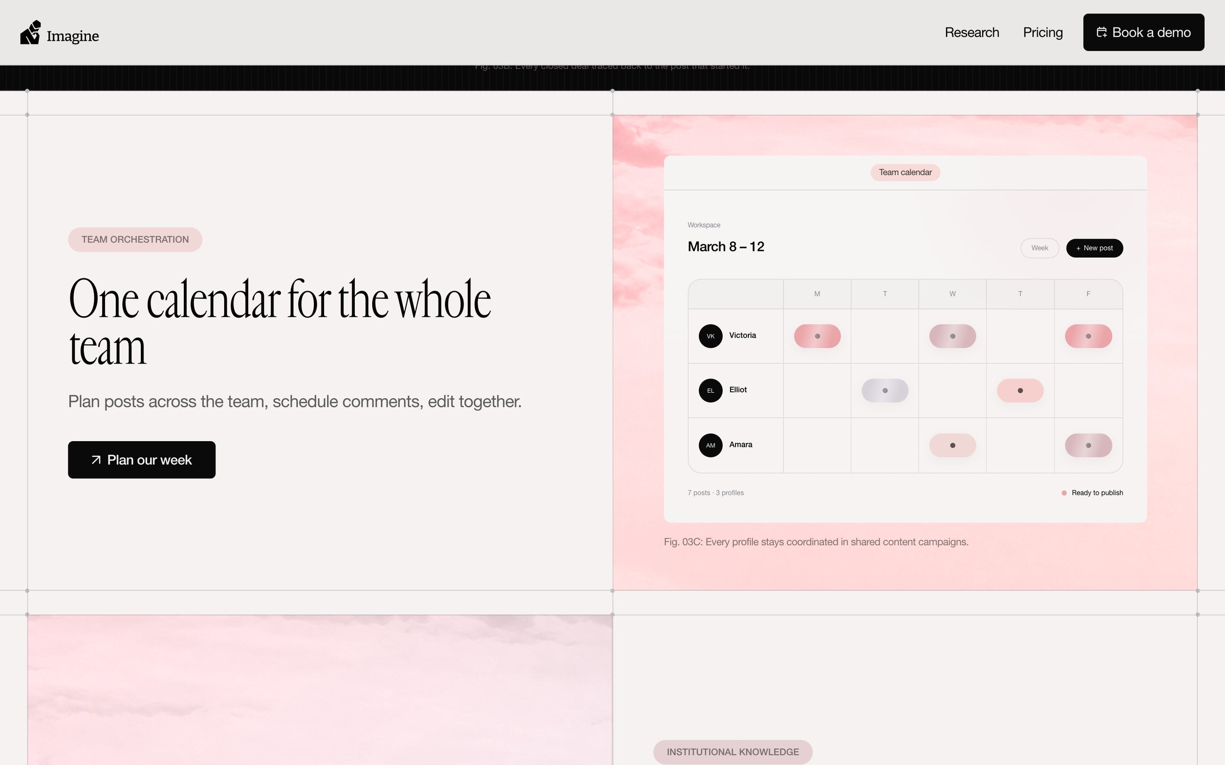
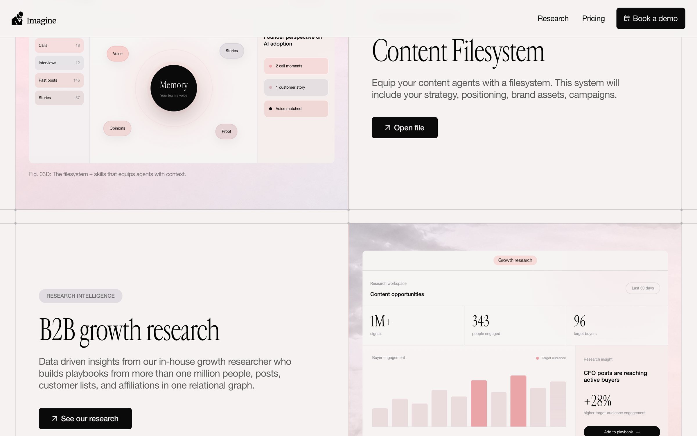
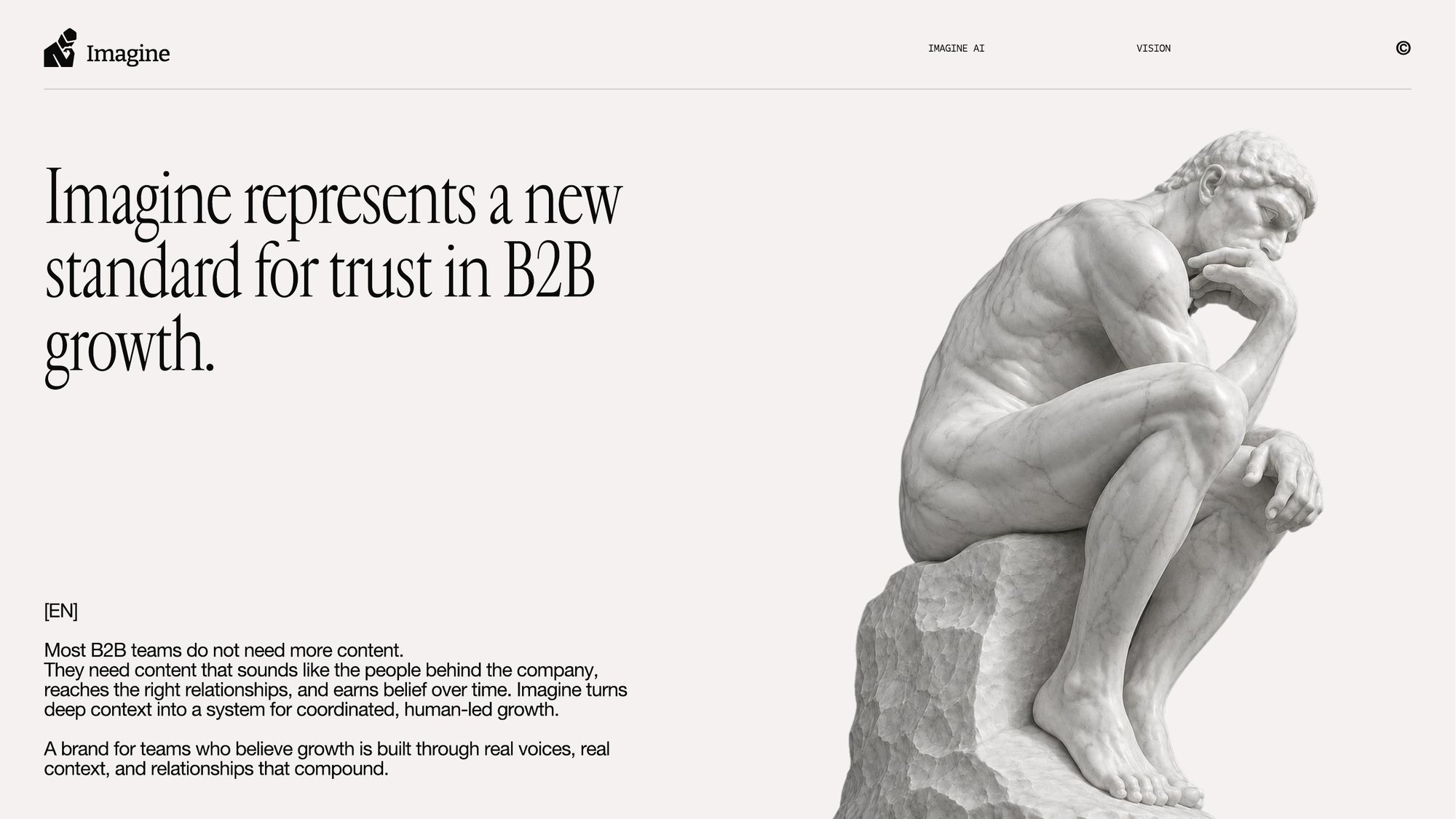
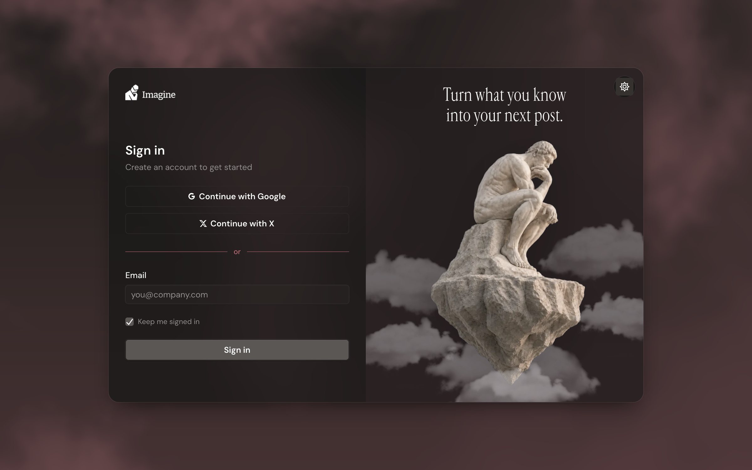
Imagine's website, useimagine.ai, speaks in a completely different voice from the old app: Rodin's Thinker, an editorial serif, warm paper tones, and a dusty rose. Signing in felt like switching companies. The redesign closes that gap so the product and the brand feel like the same company.
Agent first
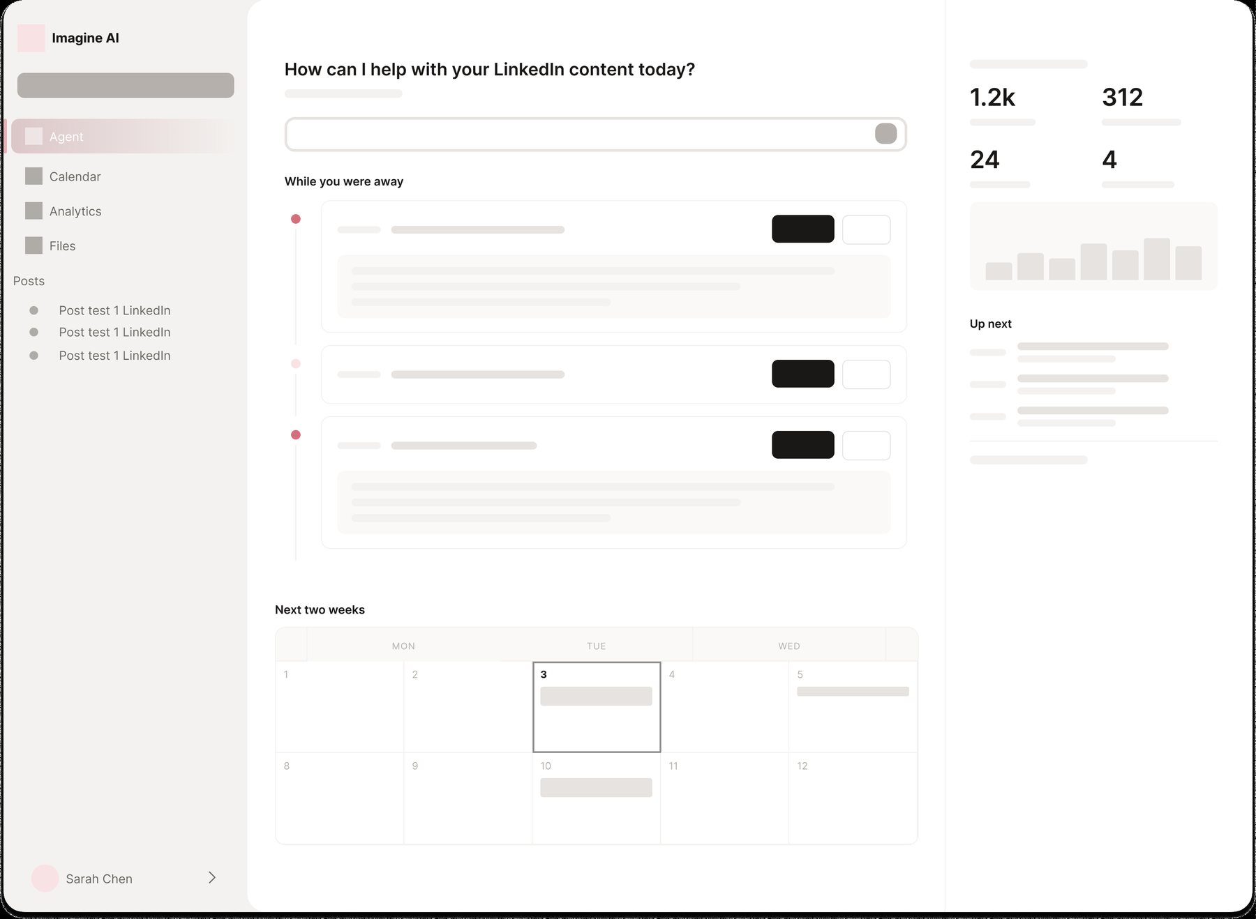
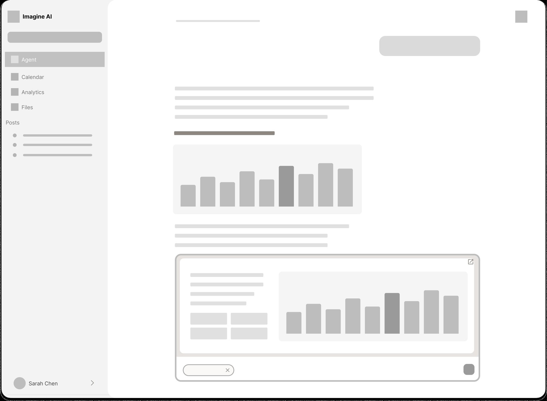
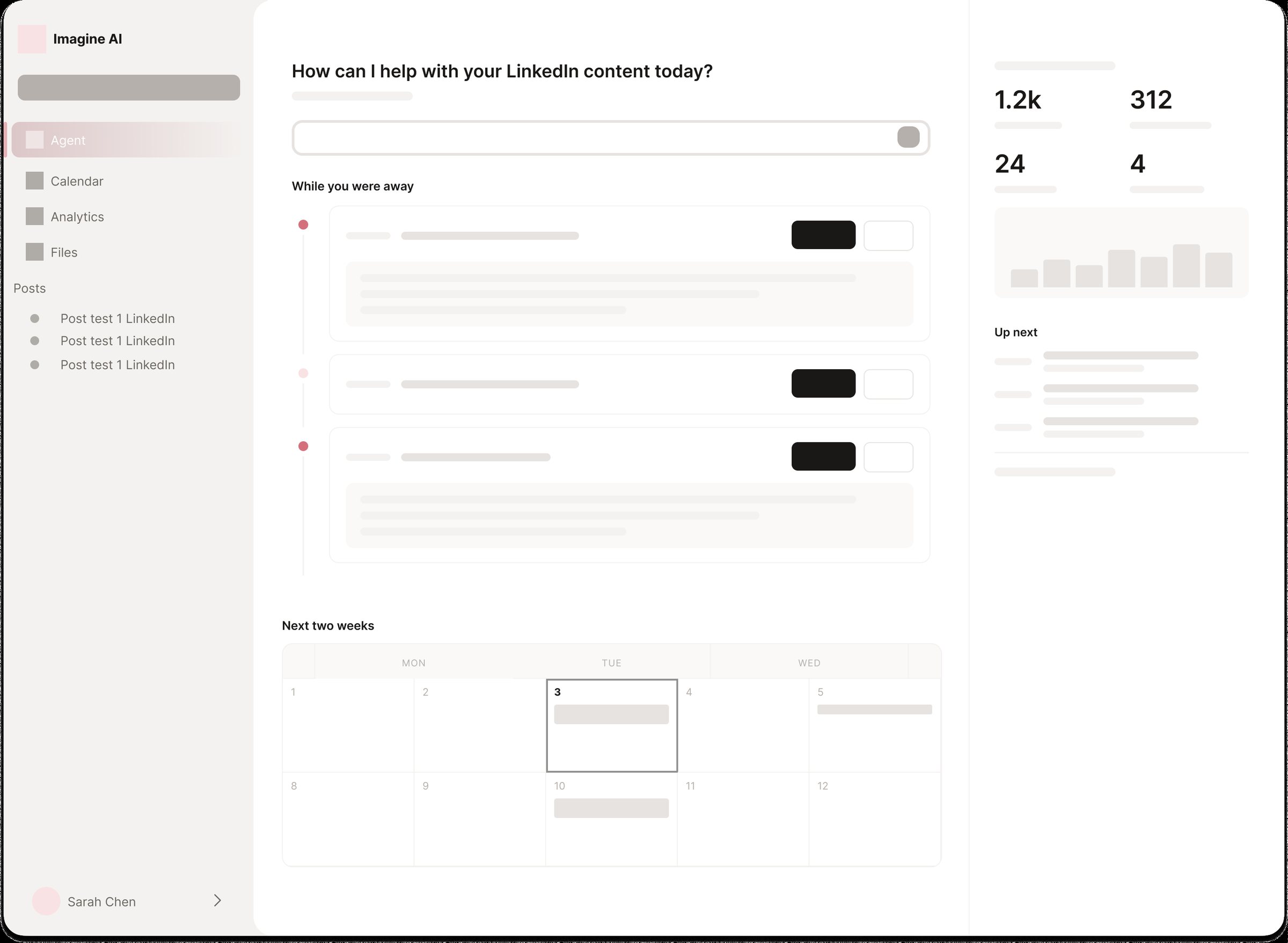
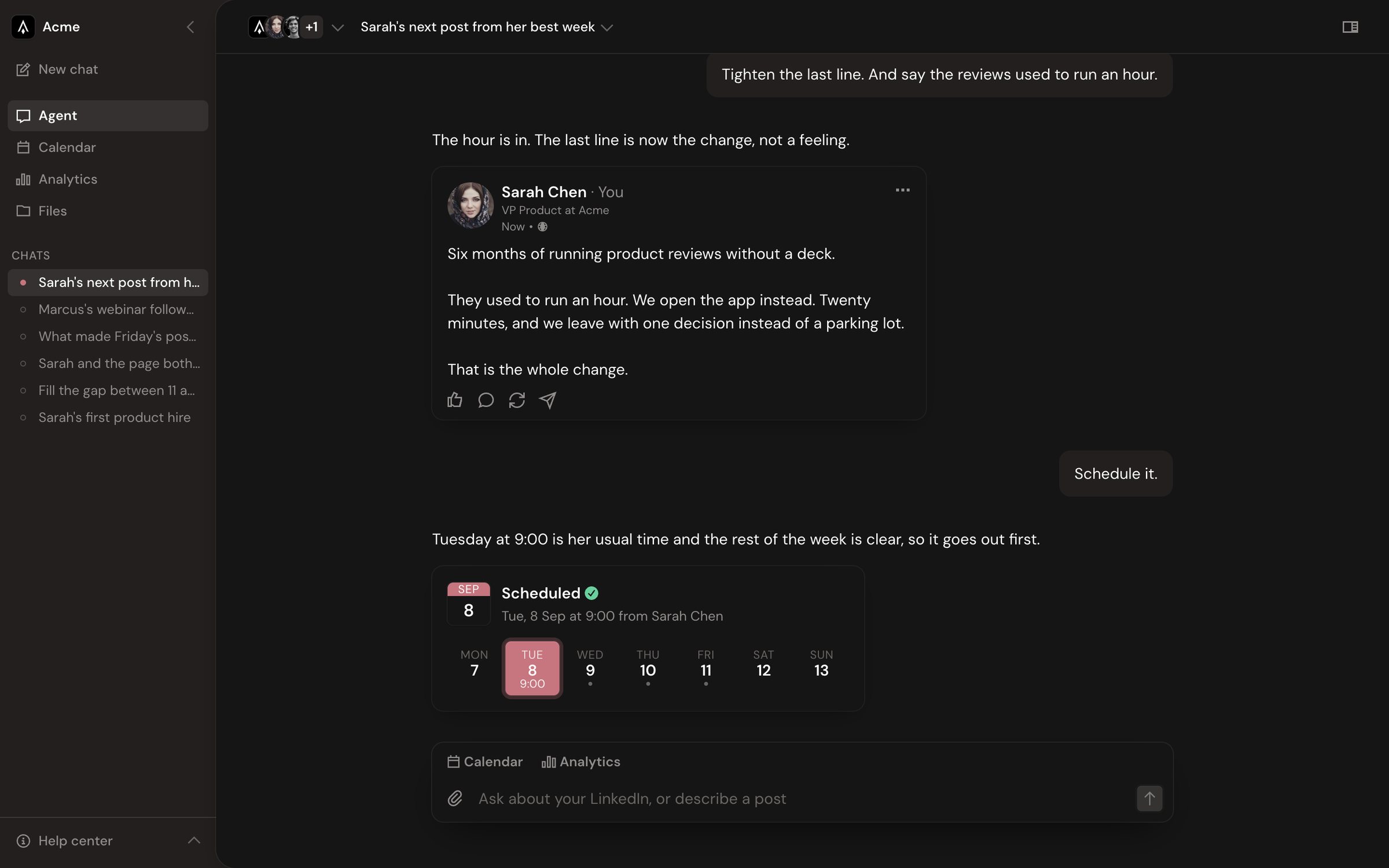
The product is the agent, so the agent should be the home screen. Instead of reading dashboards and deciding what to do, people open Imagine, see what the agent did while they were away, and approve or redirect it in one conversation.
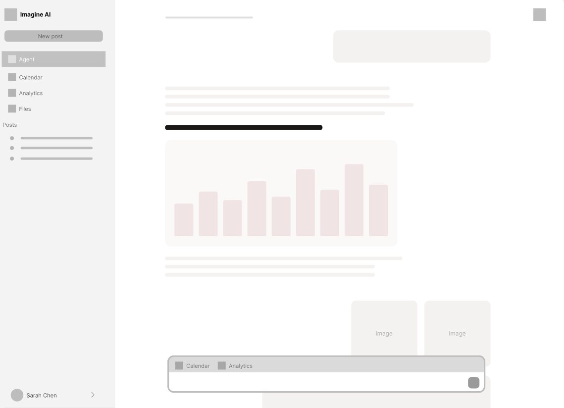
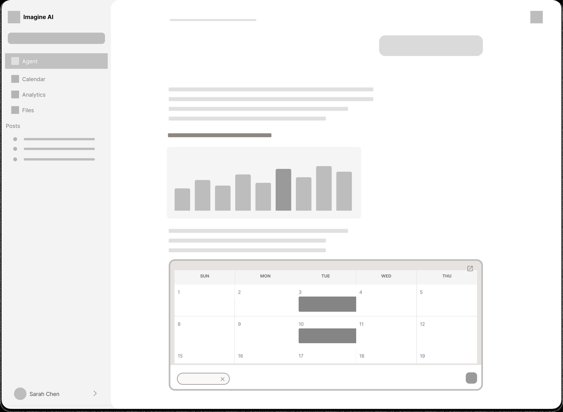
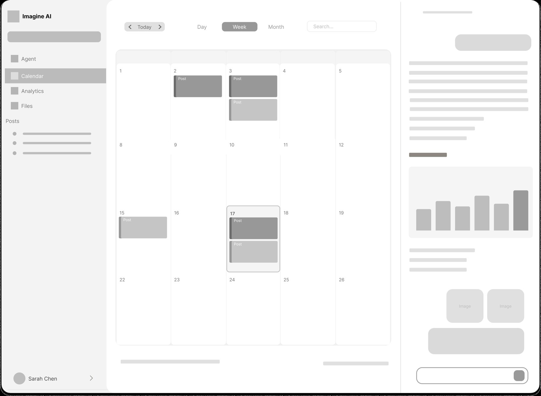
Calendar and analytics stop being destinations you have to interpret. The agent pulls them into the chat as evidence for what it recommends, and they expand into full pages only when you want the detail.
- Overview
- Workspace
- Analytics
- Neo4j Analytics
- Network
- Profiles
- Simple Research
- Deep Research
- Settings
- Agent
- Calendar
- Analytics
- Files
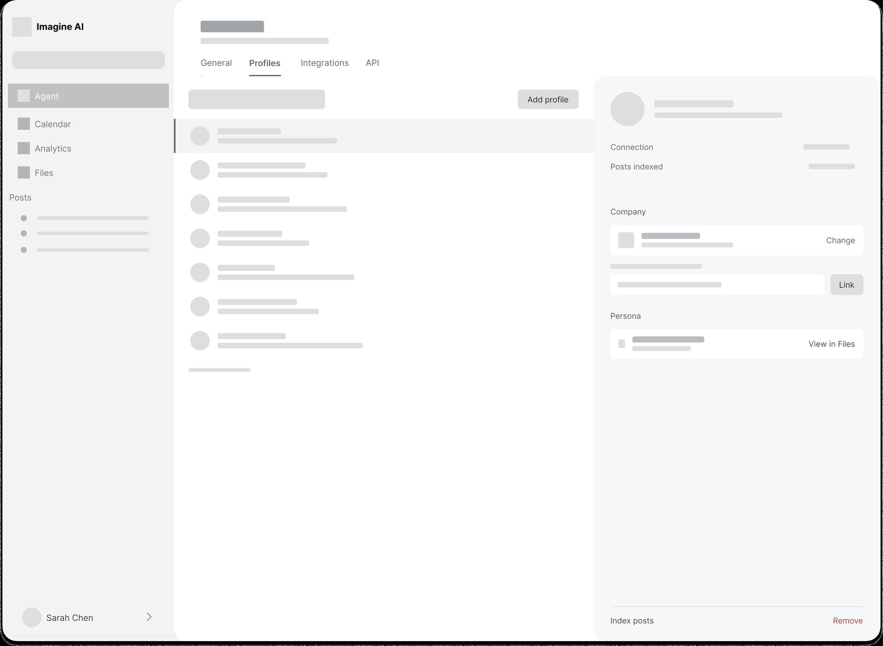
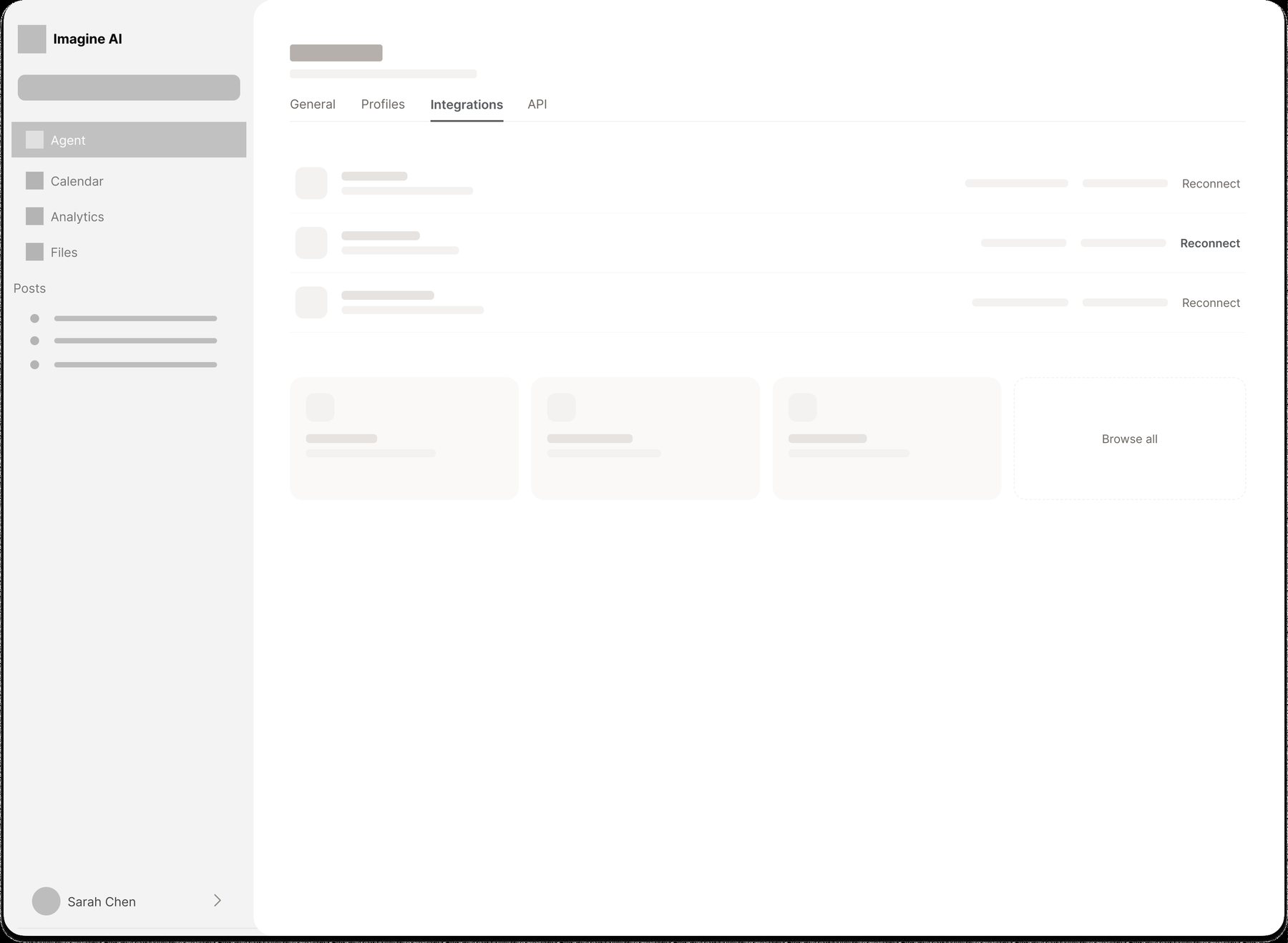
Chats live under the nav. Profiles, integrations, and API keys move into Settings.
- Show the work.Lead with what the agent did and what needs approval.
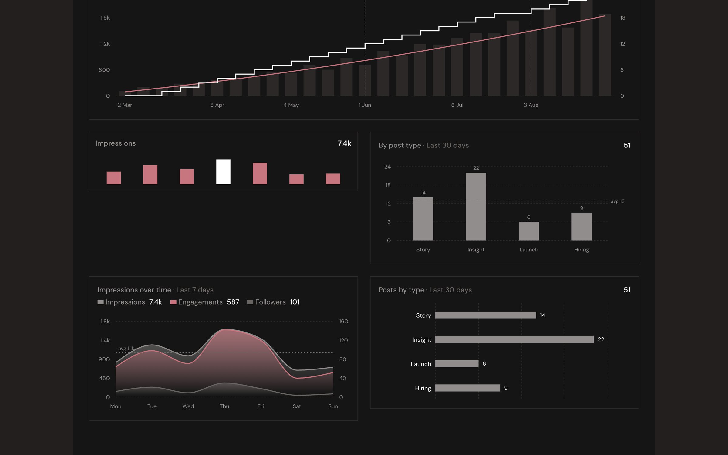
- Evidence, not dashboards.Every recommendation comes with the data behind it, and that data has to be accurate and trustworthy.
- Feel premium.Calm, editorial, and unmistakably not another blue SaaS tool.
Wireframes and iteration
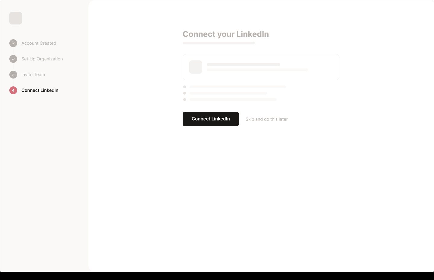
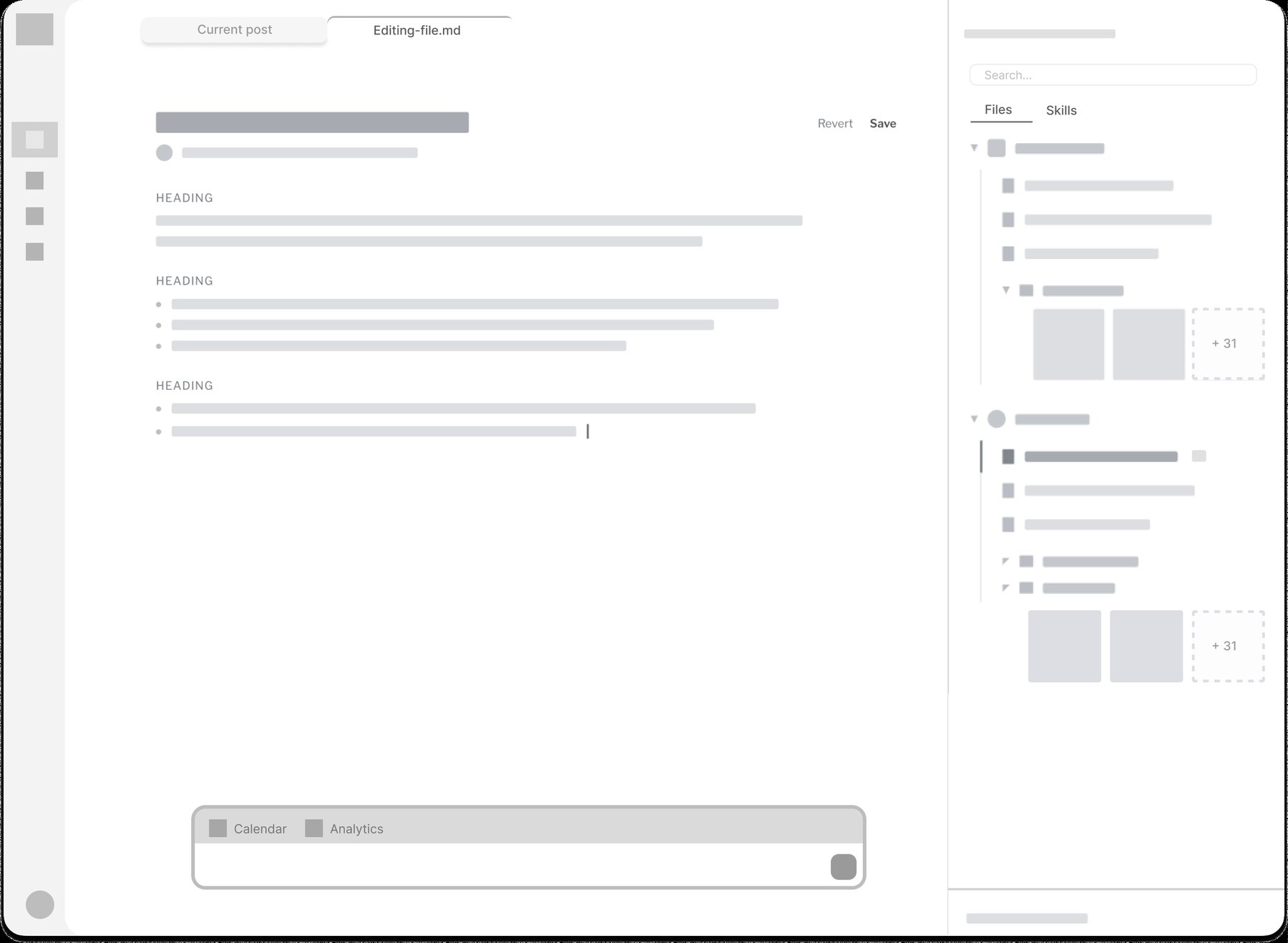
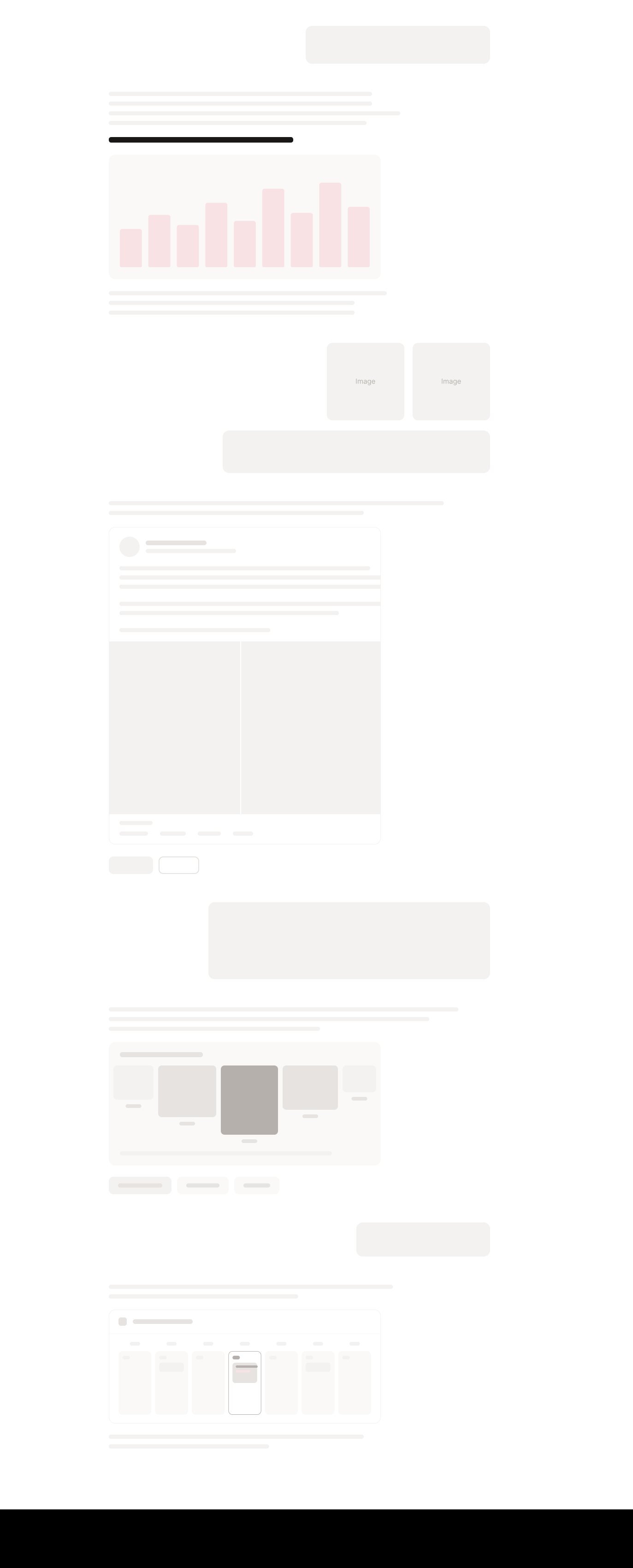
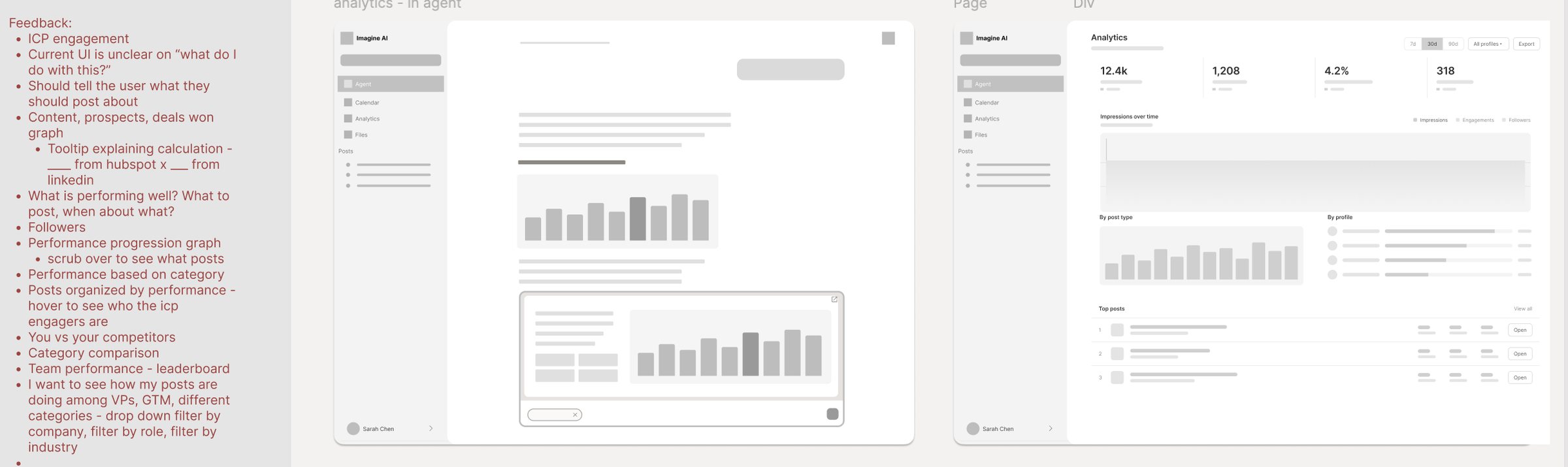
I worked structure first, in greyscale, and saved data and visual decisions until after reviewing the flows with the team. The Agent home went through four versions before it felt like an agent and not a dashboard with a search bar.
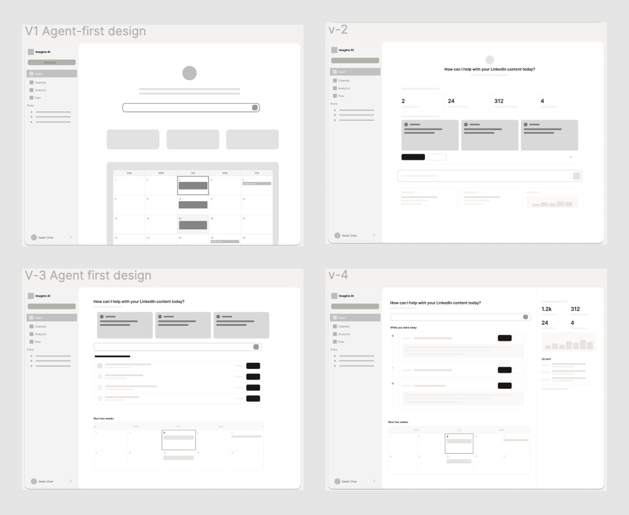
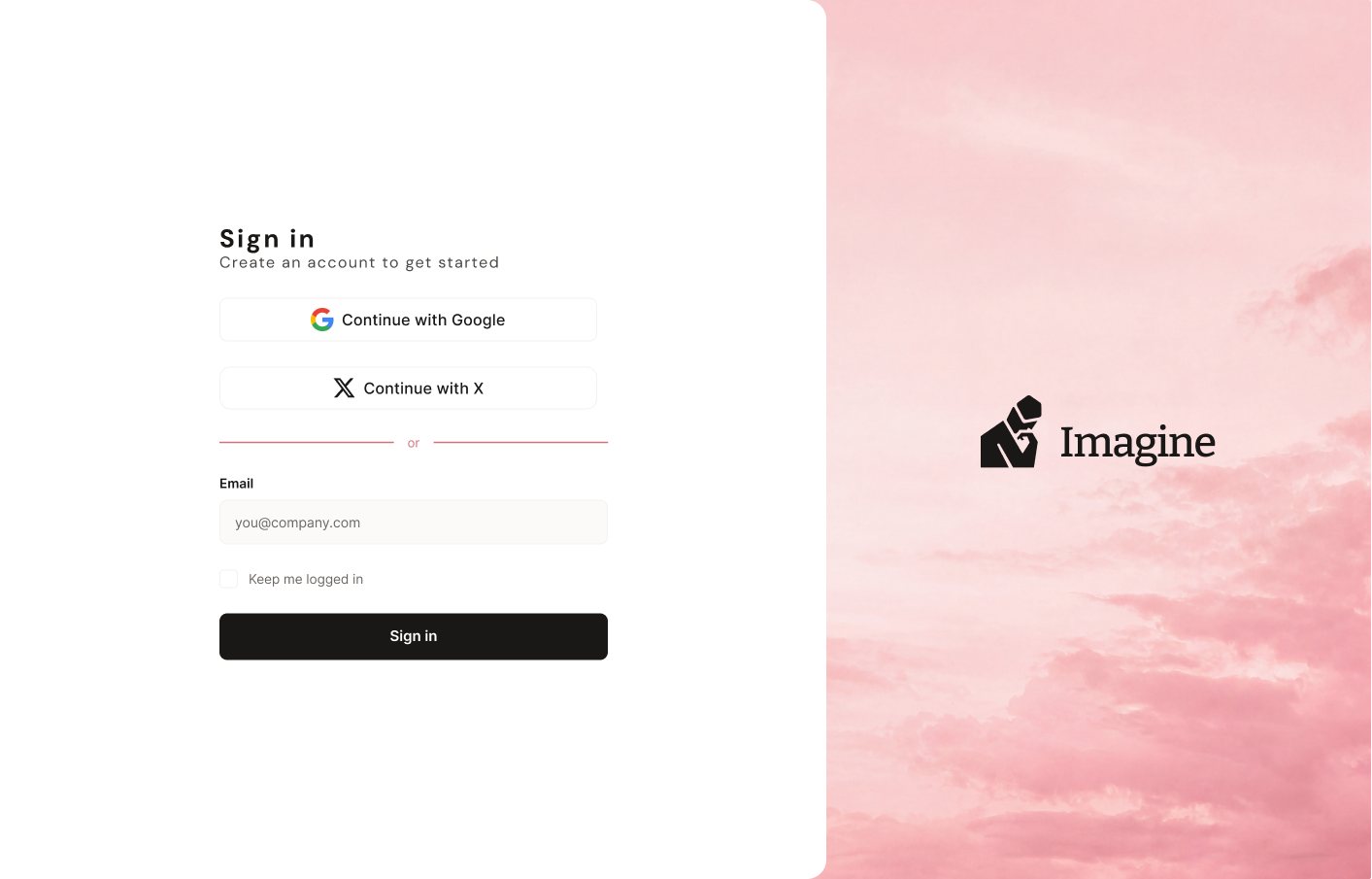
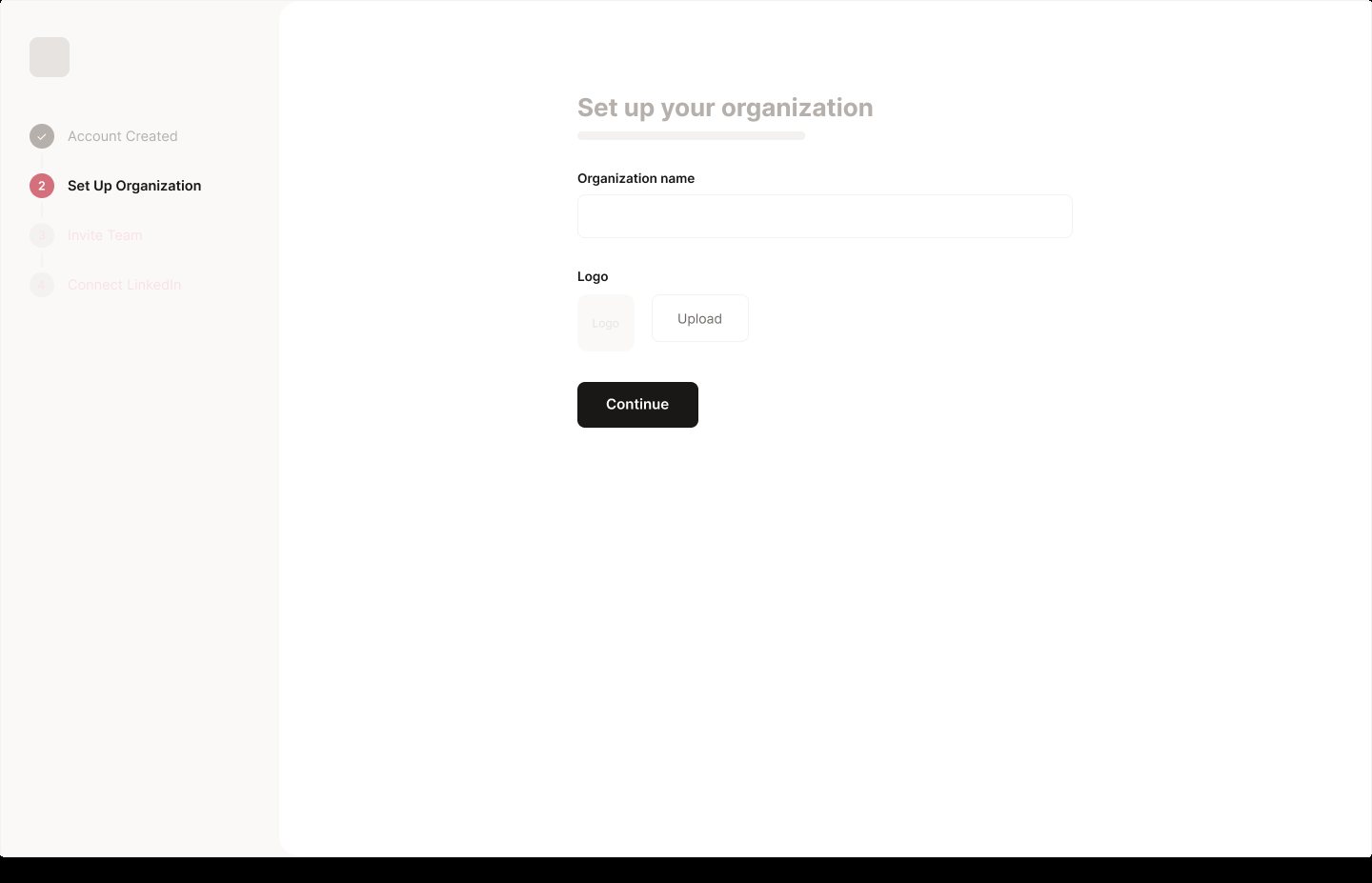
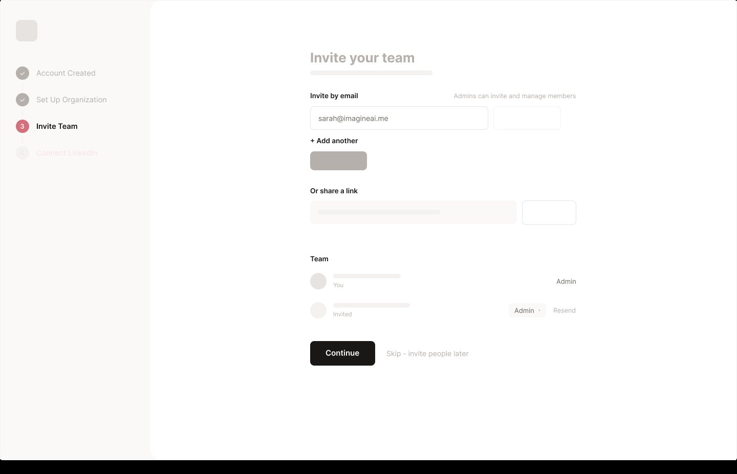
Every page and interaction, from sign-in to settings. These fixed layout and behavior; visual polish came later.
A new surface: Files
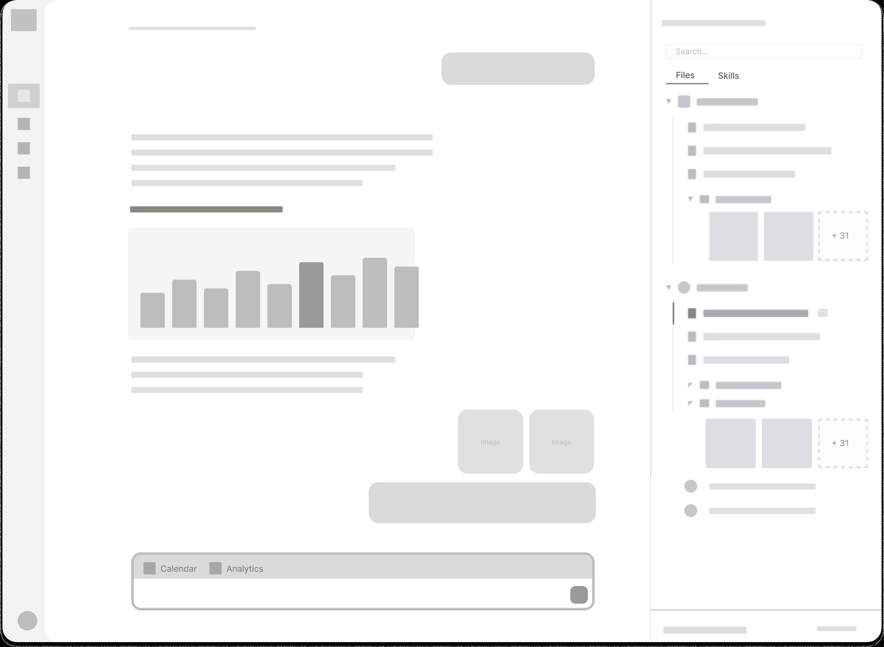
The original app had no file system. Everything the agent knew about a company, its positioning, brand voice, campaigns, and each person's persona, was invisible and impossible to edit. You could only see the output, never what it was written from.
Feedback on the first round of wireframes asked for a place for that knowledge, so I designed Files from scratch. If the agent writes from memory, people should be able to read and correct that memory.
- Org first, then people.Company files sit at the top: brand voice, posting rules, product notes, campaigns. Each teammate gets their own folder below with a persona and post ideas.
- Markdown, not forms.Memory is plain markdown files the agent reads and people can edit, so nothing about the agent's context is hidden.
- Next to the conversation.Files open in a right sidebar beside the chat. Editing one opens a tab next to the conversation, and assets can be dragged straight into a message.
- Skills alongside files.A Skills tab holds reusable instructions: built-in skills are read-only, and each org can add its own.
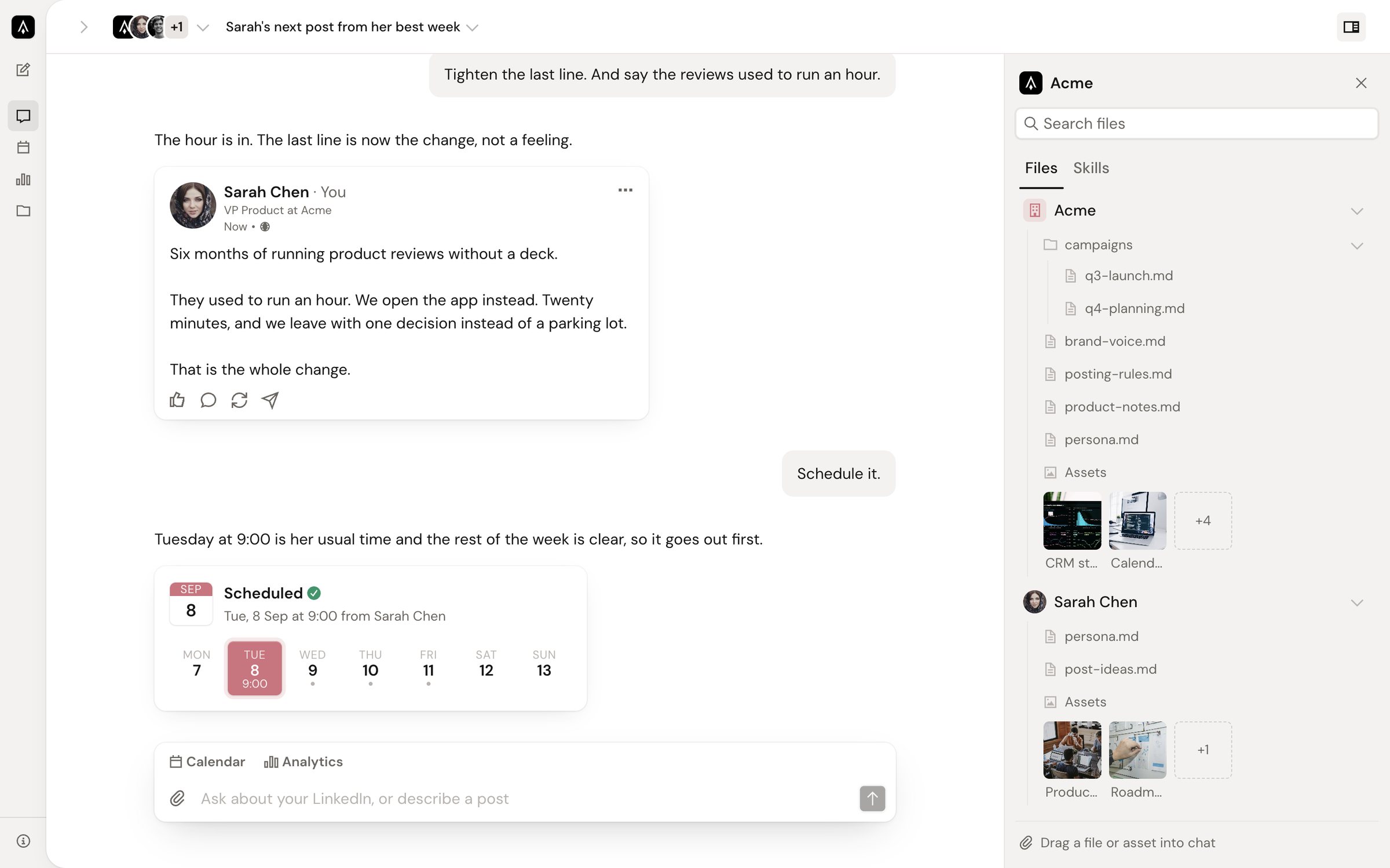
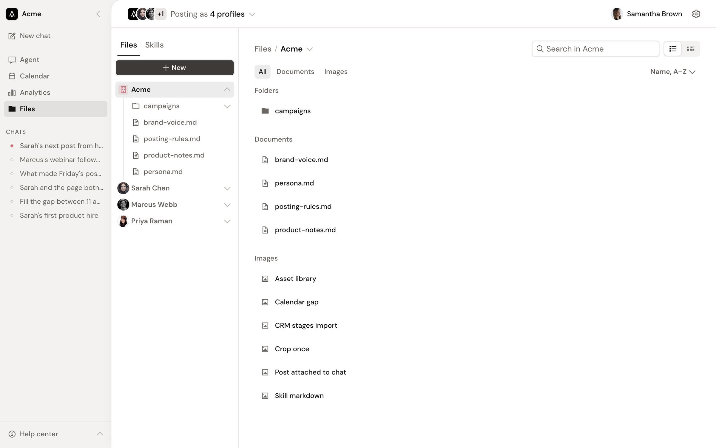
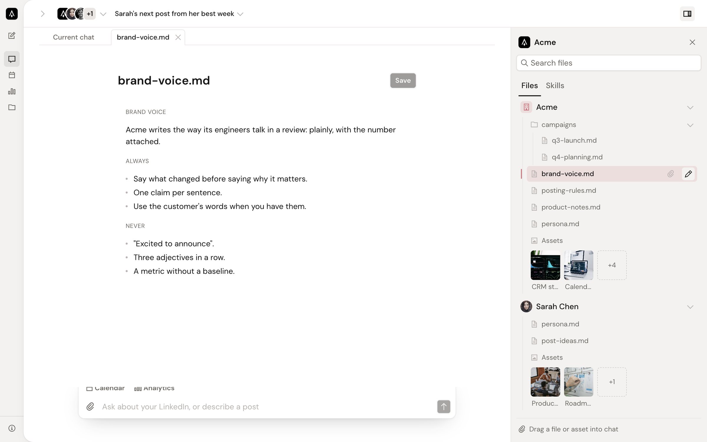
I then built it into Imagine's production app as Memory, on the workspace filesystem SDK the agent already uses, with a folder tree, list and grid views kept in the URL, upload, new folder, delete with a confirmation, and previews for images, video, and text.
Color
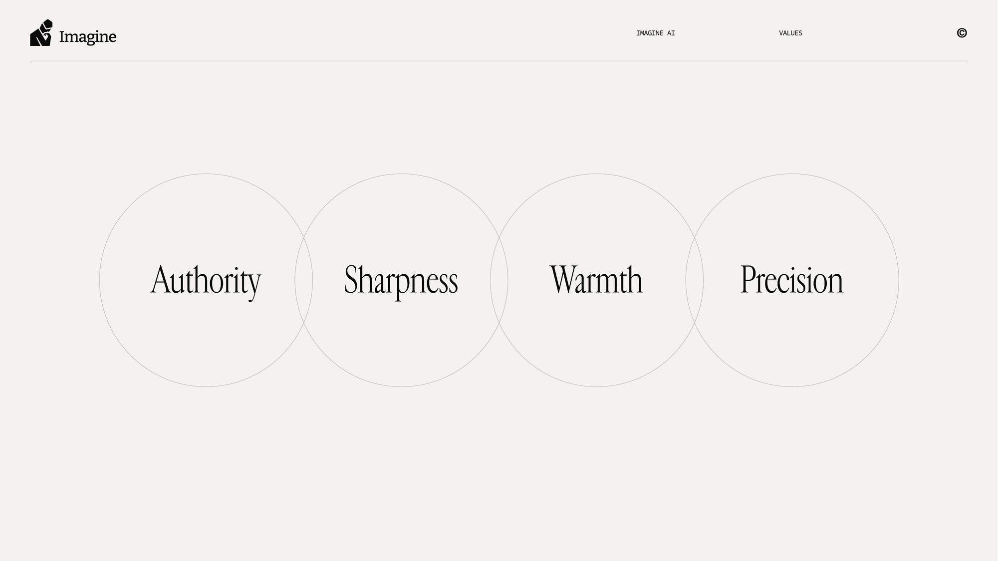
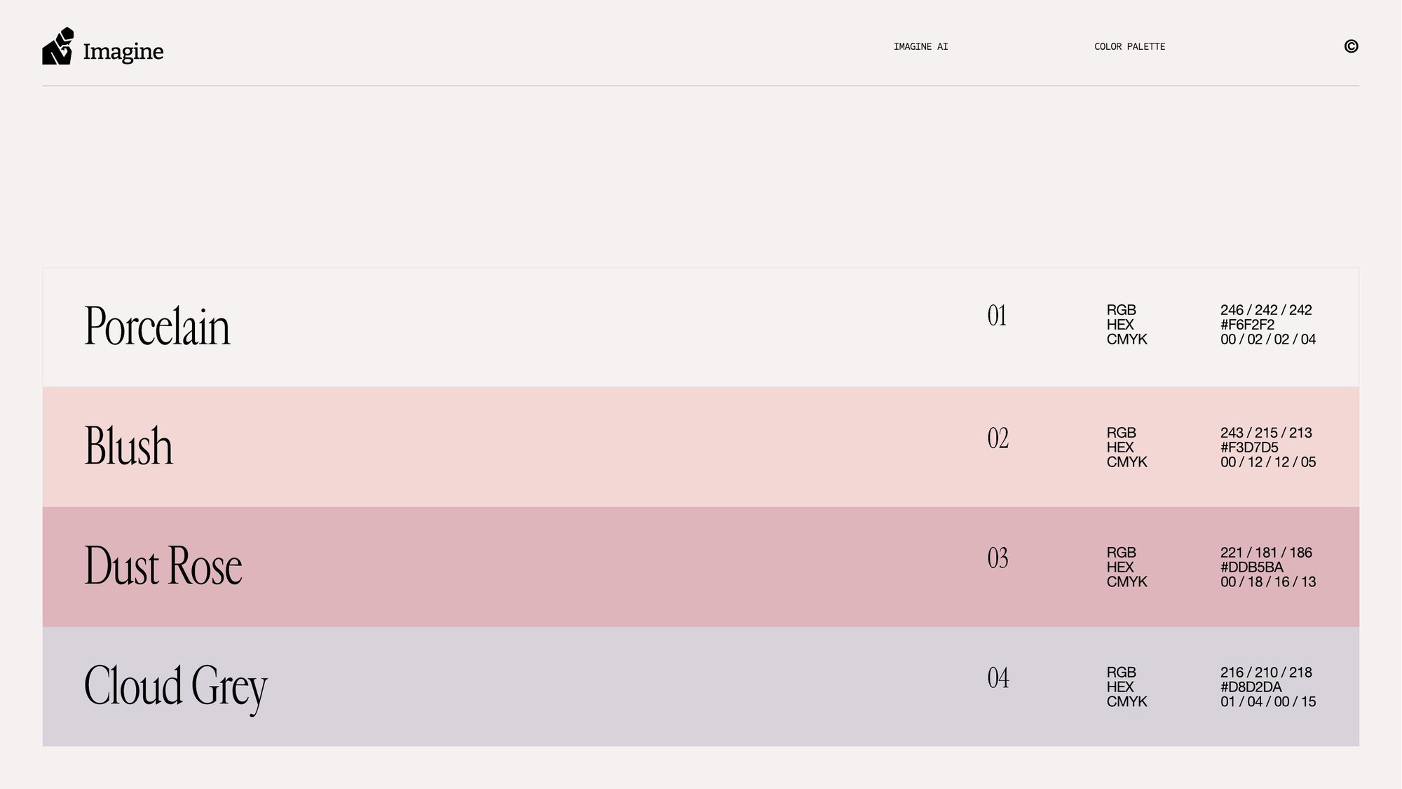
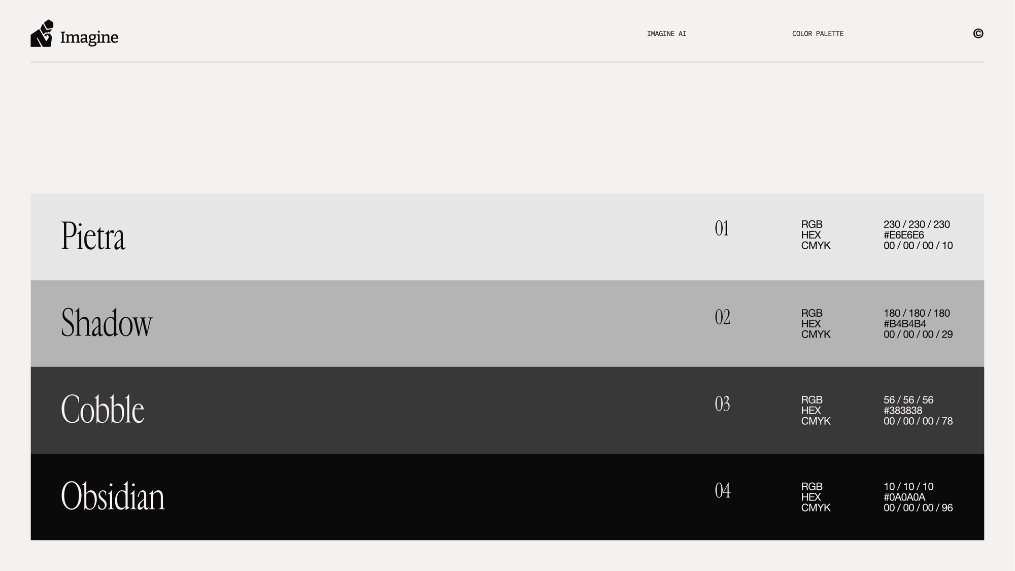
Imagine's brand guidelines describe a company that should feel “analytical without becoming mechanical, and human without becoming soft,” built on four values: authority, sharpness, warmth, and precision. Its palette is two families: warm Porcelain, Blush, Dust Rose, and Cloud Grey, and a neutral run from Pietra to Obsidian. None of it is blue.
The old app ignored all of that. LinkedIn is blue, the old app was blue, and almost every tool in the category is blue, so drafts looked like LinkedIn's own chrome and the product looked like a different company from its website. The product palette is the brand palette, tuned to work as an interface.
Inside the brand's range there were still real choices: how much rose, how warm the greys, what dark mode should be. I explored thirteen palettes, then tested the strongest ones on the same real screen before choosing.






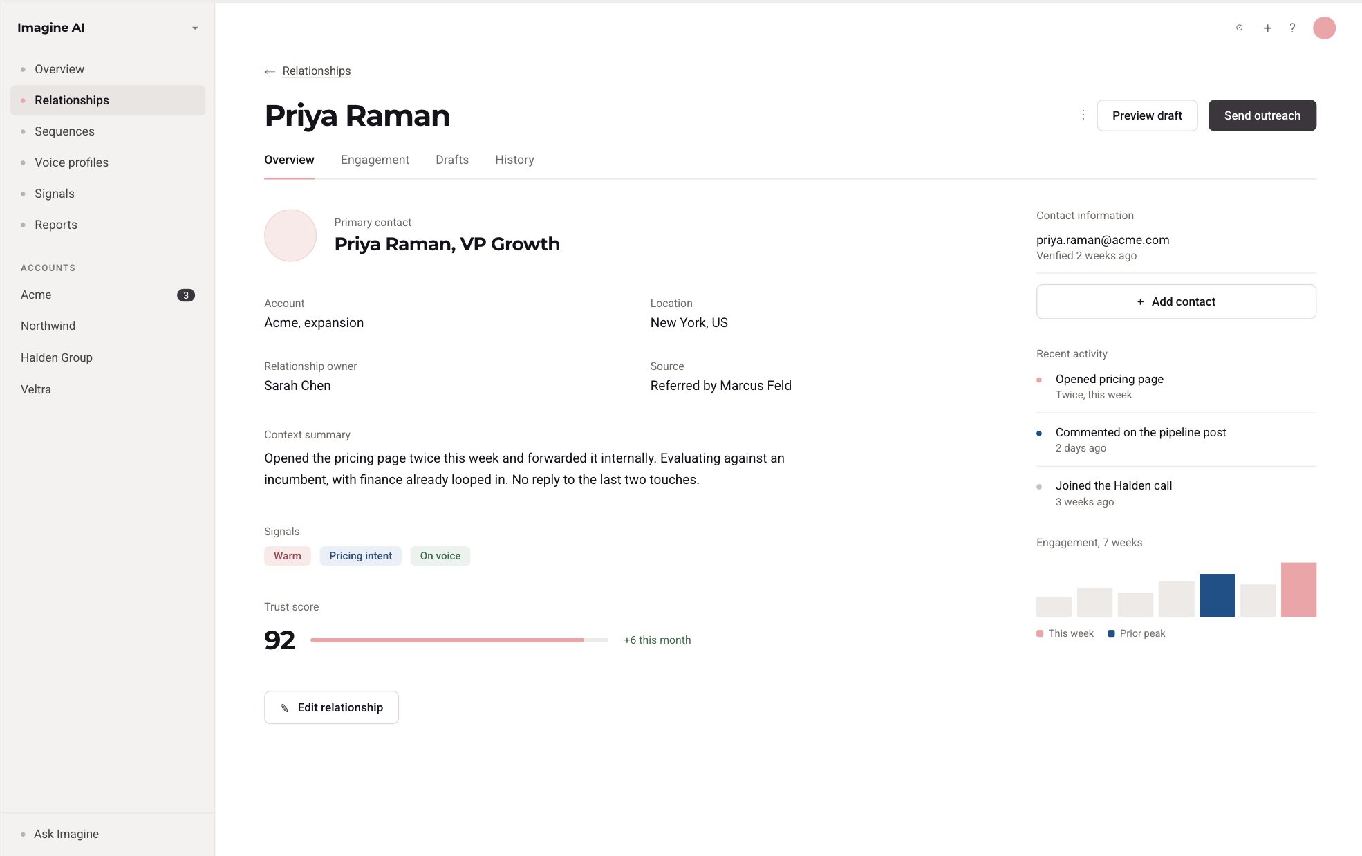
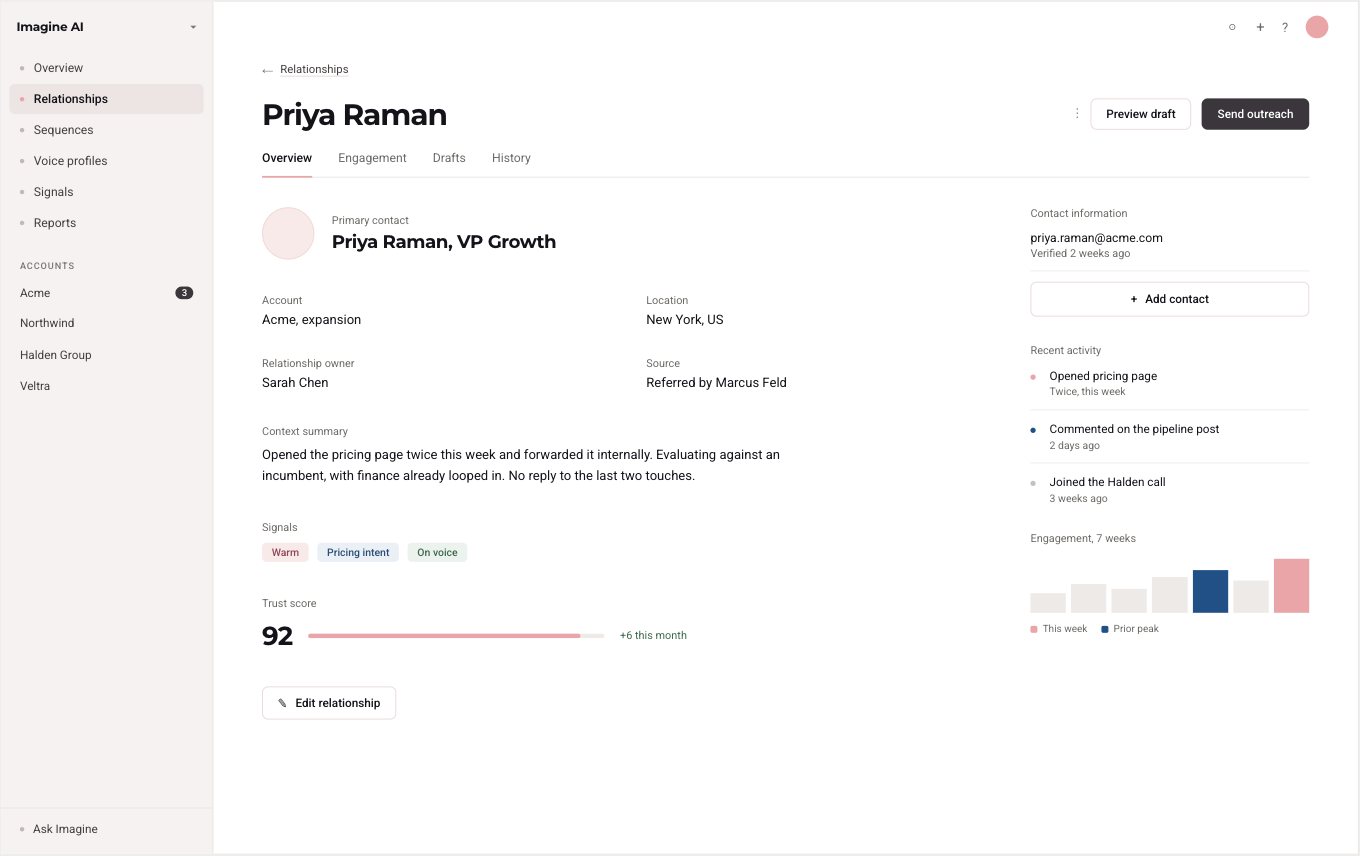
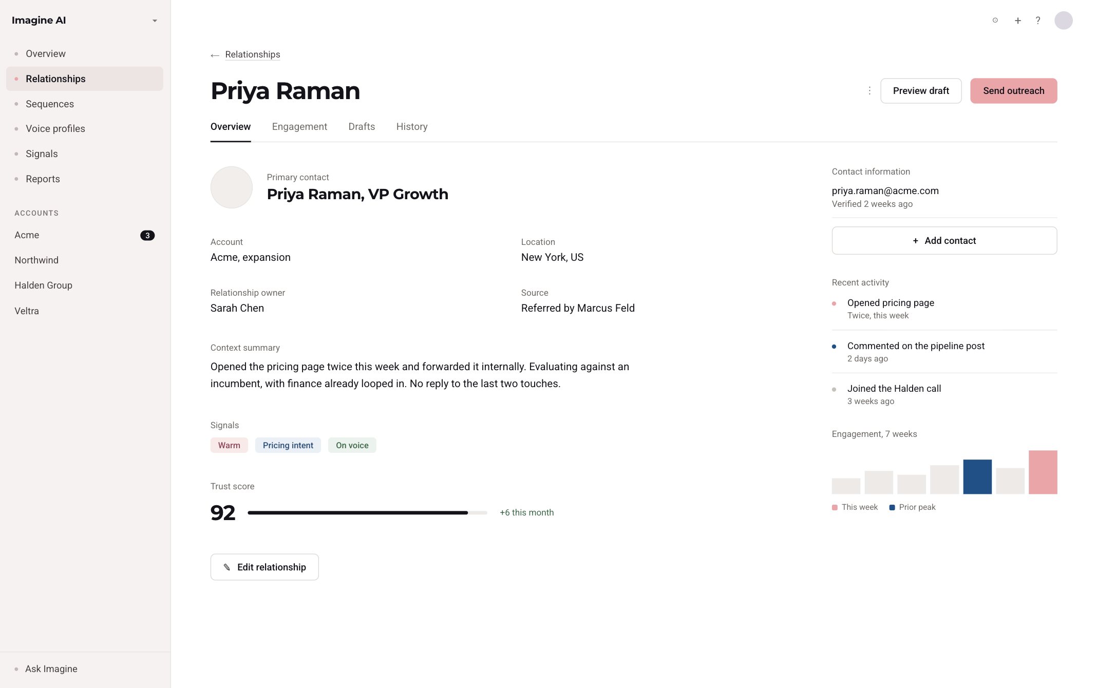
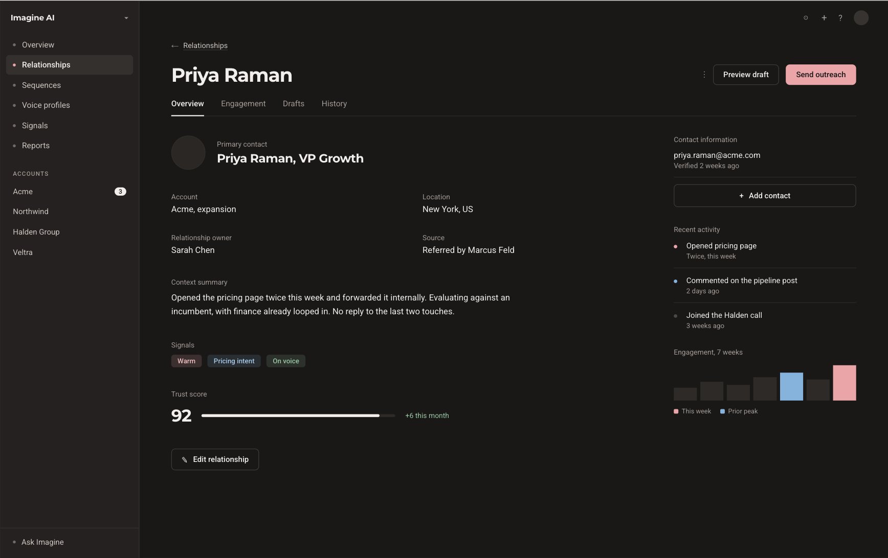
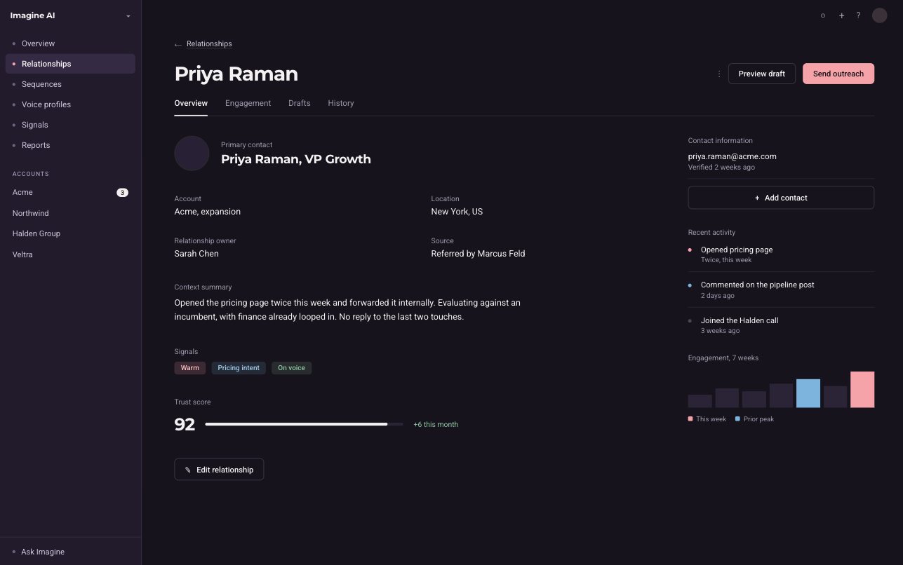
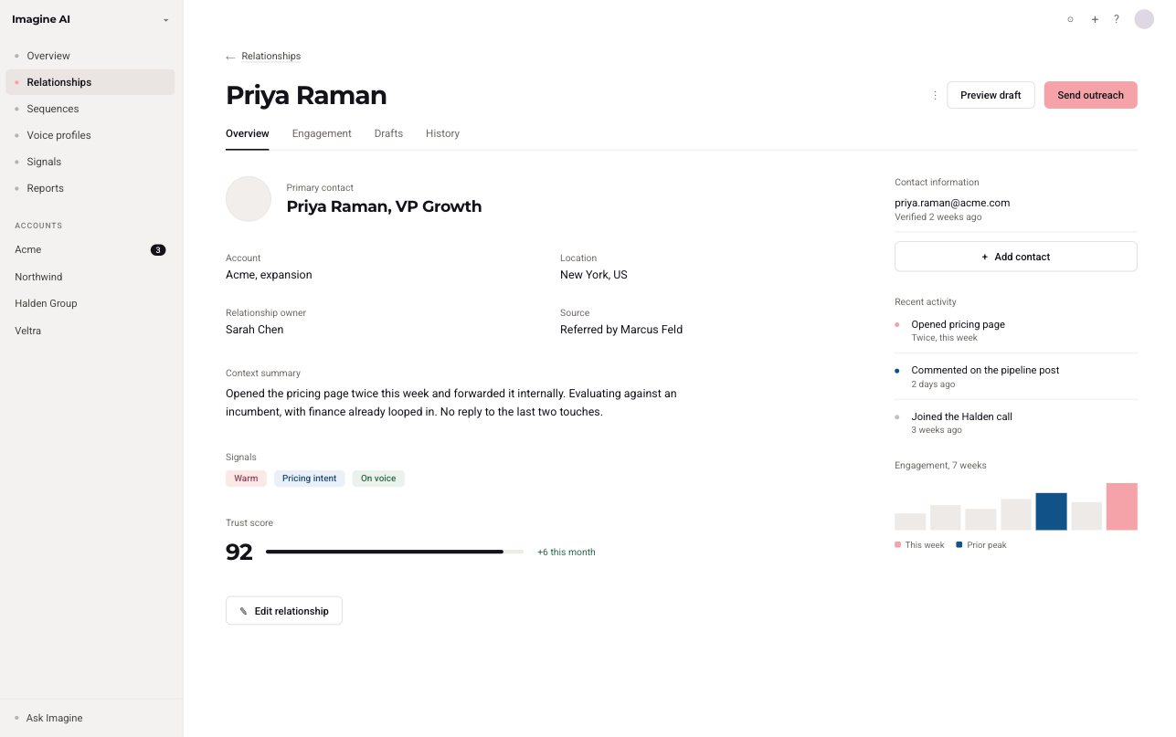
Same screen, six palettes. A real layout shows what a swatch card can't: how much accent a dense screen can actually hold.
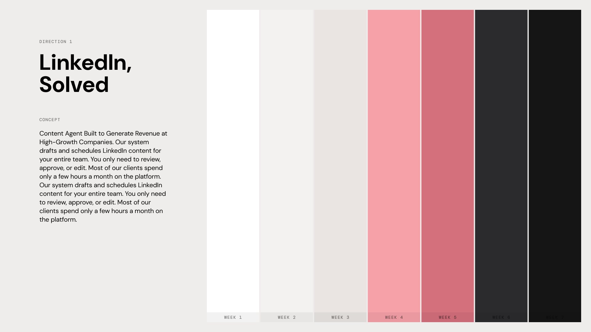
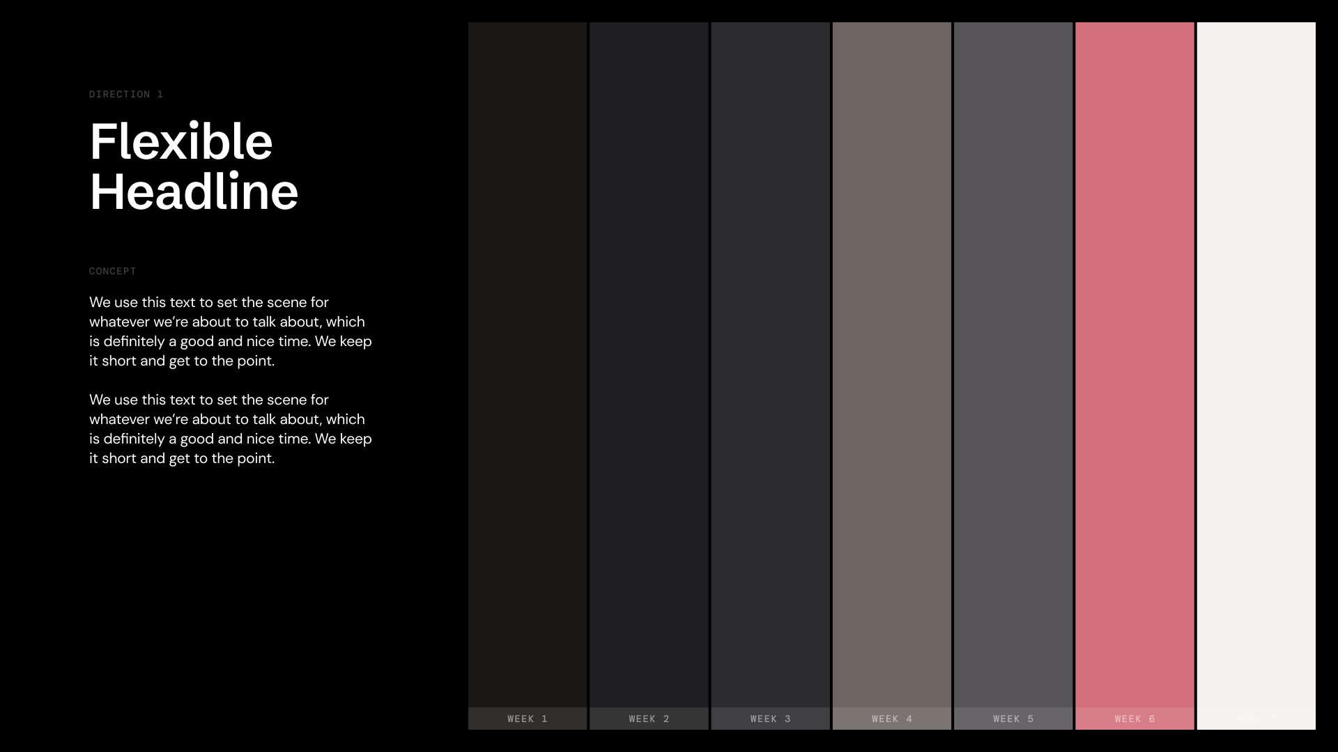
- Rose instead of blue.It comes straight from the brand's Dust Rose. It stands apart in a category of blues and reads warm and human, which is the point of a product about real people's voices. Keeping it desaturated keeps it premium rather than playful.
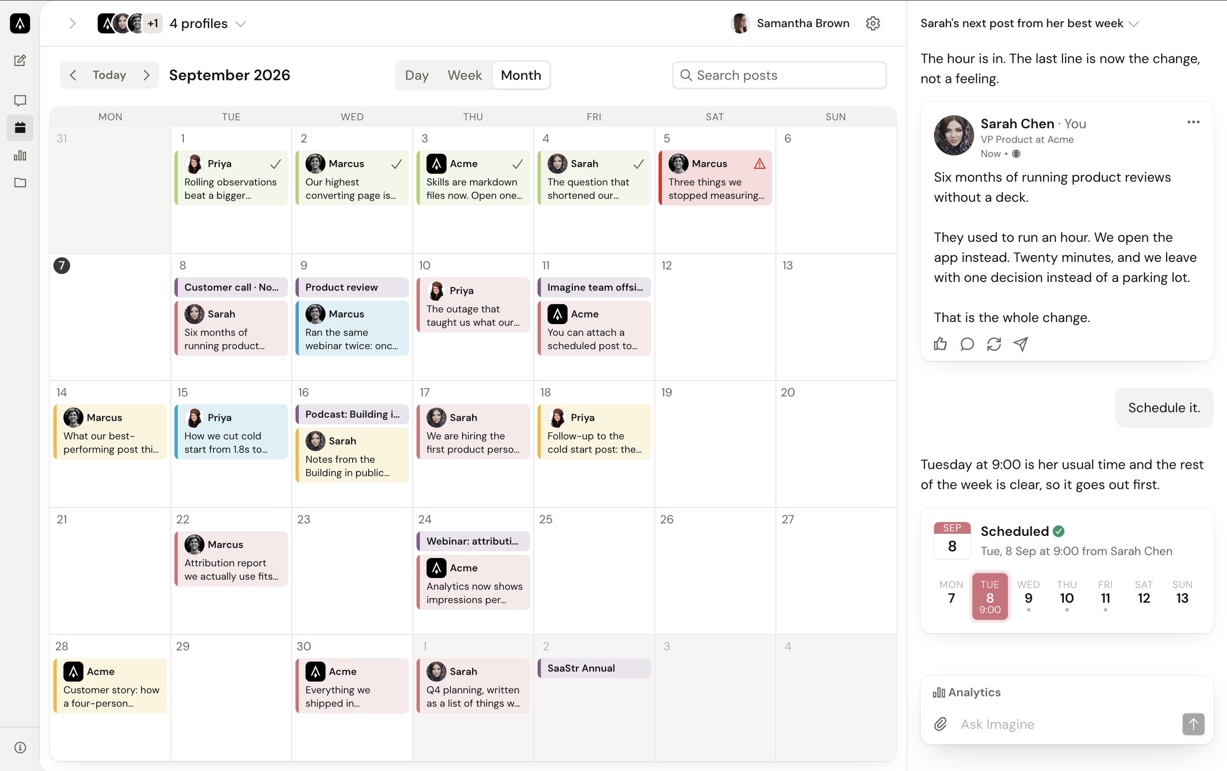
- Sharper corners, too.The old UI rounded everything heavily, which added to the generated look. The new system uses three small radii, 6px for controls, 12px for panels, and 20px for the outer surface, so shapes feel precise, matching the brand's sharpness without turning cold.
- Pink is a signal, not a surface.White on rose measures 3.28:1, below WCAG AA for text, so primary buttons are charcoal at 10.1:1. Rose is reserved for selection, the scheduled day, status, and charts, so when it appears, it means something.
- Warm neutrals, not cool greys.Imagine is a writing tool. Paper tones make the workspace feel like a page rather than a console, and they sit naturally next to the rose.
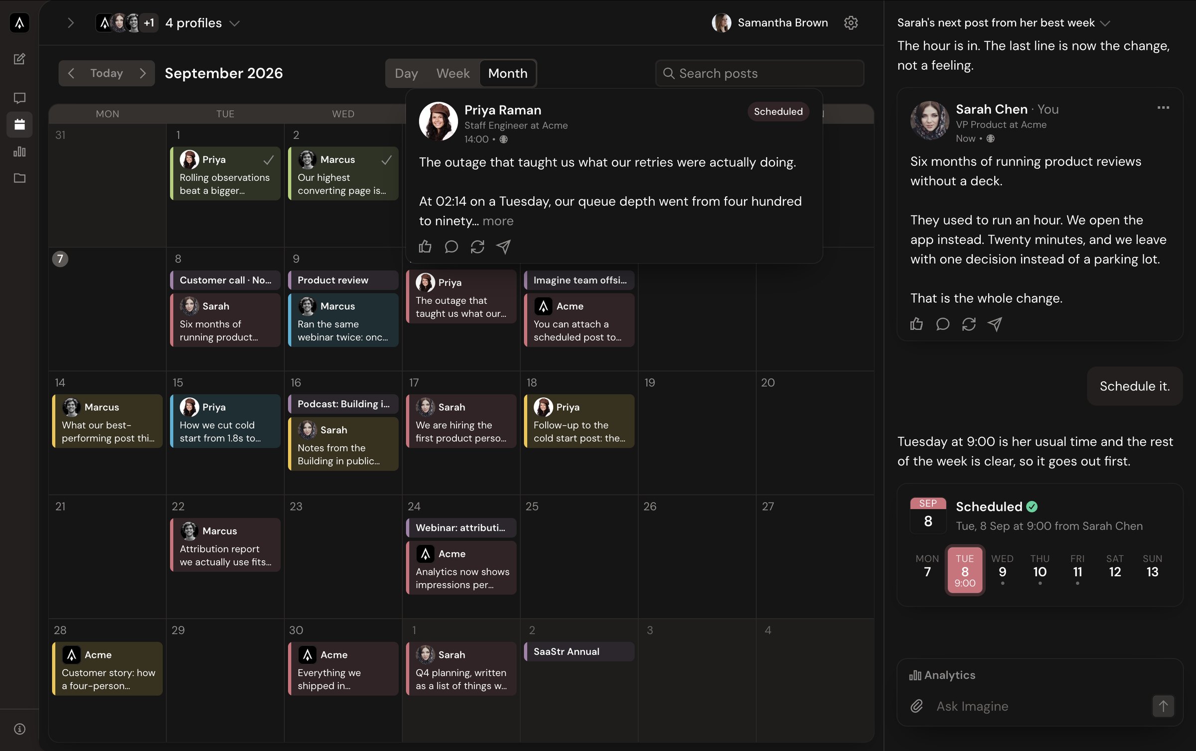
- Dark mode is its own palette.The sidebar is a warmer, lighter charcoal and the page sits darker, so the chrome recedes and body text can be pure white. Rose lifts to #E0838D to hold up on dark, and elevation comes from an inset highlight because drop shadows disappear on black.
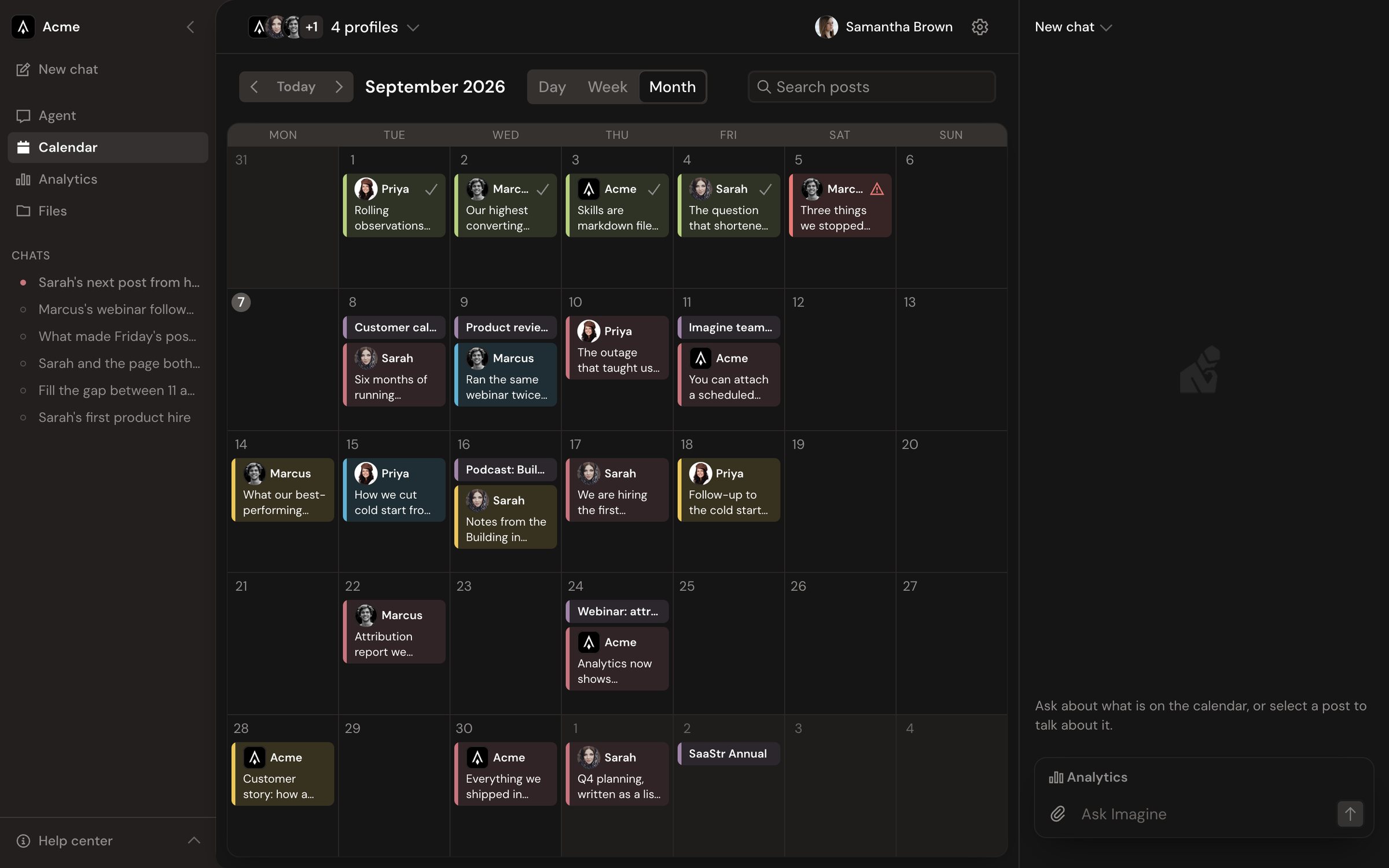
- Status colors tuned in context.Calendar chips use a 16% wash of each status color with a solid rail. Gold replaced a paler yellow because at 16% the yellow read as cream next to rose and blue.
Typography
The brand pairs Cardinal Fruit, an editorial serif, for titles with Helvetica Neue for descriptions. That works on a billboard but not in a dense product UI. I tested twelve pairings on real product copy, and my notes became a rule: wide geometric display faces lose legibility below 32px, so keep display type out of the product.
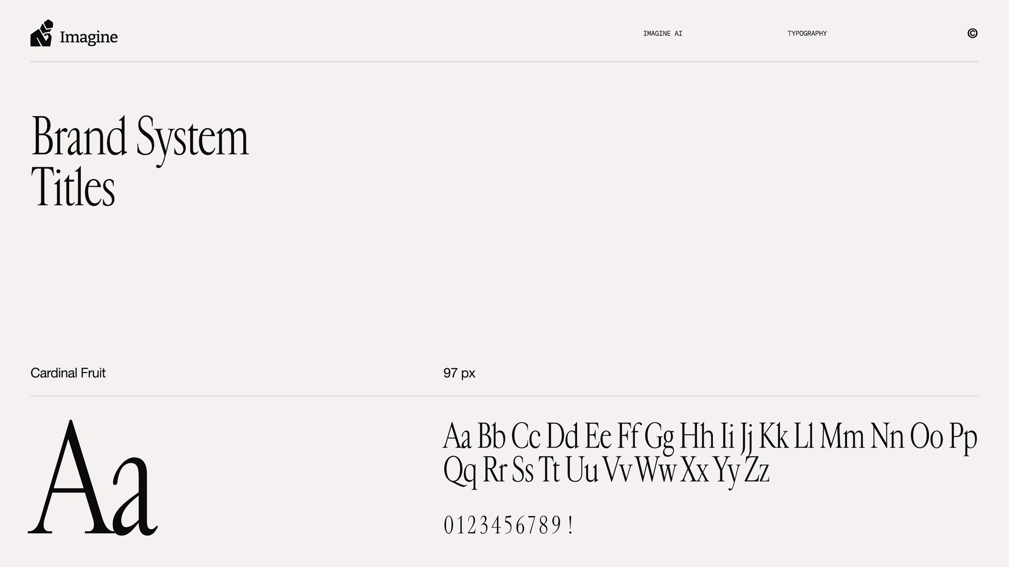

Headings and body, every weight from one family.
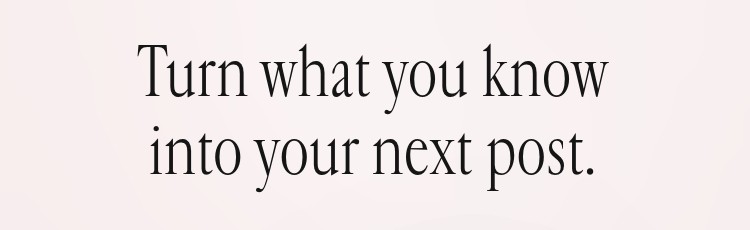
A display serif for the first impression, never inside the app.
- Serif at the door, workhorse inside.Cardinal Fruit is beautiful at 97px and unreadable in a 12px calendar chip. It sets one line on the sign-in screen, next to Rodin's Thinker, and never appears in the working UI. Helvetica Neue needs separate web licensing and runs tight at small sizes.
- One family that holds up small.DM Sans is a low-contrast geometric sans designed for smaller text sizes, with an optical size axis. One family keeps hierarchy in size and weight, and stays crisp from a calendar chip to a 300-word draft.
- Seven steps, all tokens.The scale lives in the token file and Tailwind's text sizes are folded onto it, so even vendored components follow it.
Design system
Every color, spacing step, radius, control height, and type size lives in one file. It emits CSS variables, and Tailwind's own scales are folded onto them, so p-4, text-sm, and rounded-lg all resolve to tokens. Changing a number there retunes the whole product in both themes. Editing a color anywhere else is a bug.
// src/styles/tokens.ts: the only place a color is allowed to live
export const colors = {
  light: {
    background: "#f4f2f0",   // warm paper
    surface: "#ffffff",
    border: "#eae5e3",
    foreground: "#161516",
    primary: "#3d3a38",      // charcoal: primary actions
    secondary: "#d4707c",    // rose: selection, status, data
  },
  dark: {
    background: "#231f1e",   // warmer chrome
    surface: "#151515",      // darker page, so text can go full white
    primary: "#5c5754",
    secondary: "#d4707c",
    "secondary-strong": "#e0838d",
  },
};

export const radius = { control: 6, panel: 12, surface: 20 };
export const typeScale = {
  display: { size: 32, lineHeight: 40 },
  title:   { size: 24, lineHeight: 32 },
  heading: { size: 18, lineHeight: 26 },
  body:    { size: 16, lineHeight: 24 },
  small:   { size: 14, lineHeight: 20 },
  caption: { size: 12, lineHeight: 16 },
  micro:   { size: 12, lineHeight: 16, letterSpacing: 0.04 },
};- No card inside a card. One level of surface, then content.
- Controls 6px, panels 12px, surfaces 20px. Nothing sharp-cornered.
- No divider lines walling off sections. The sidebar rounds into the page.
- No eyebrow labels or filler copy. If a label isn't doing a job, it doesn't ship.
- shadcn/ui is the starting point, customized until it no longer reads as shadcn.
- Motion is a requirement: shared-element transitions, staggered entrances, tactile press states, and a distinct thinking state for the agent.
The redesign
The calendar, old and new, in both themes. Drag the handle to compare. The old version is a blue-accented grid with a chat panel bolted on the side; the new one keeps the agent conversation beside the calendar, colors posts by status, and previews each post the way it will look on LinkedIn.
 BeforeAfter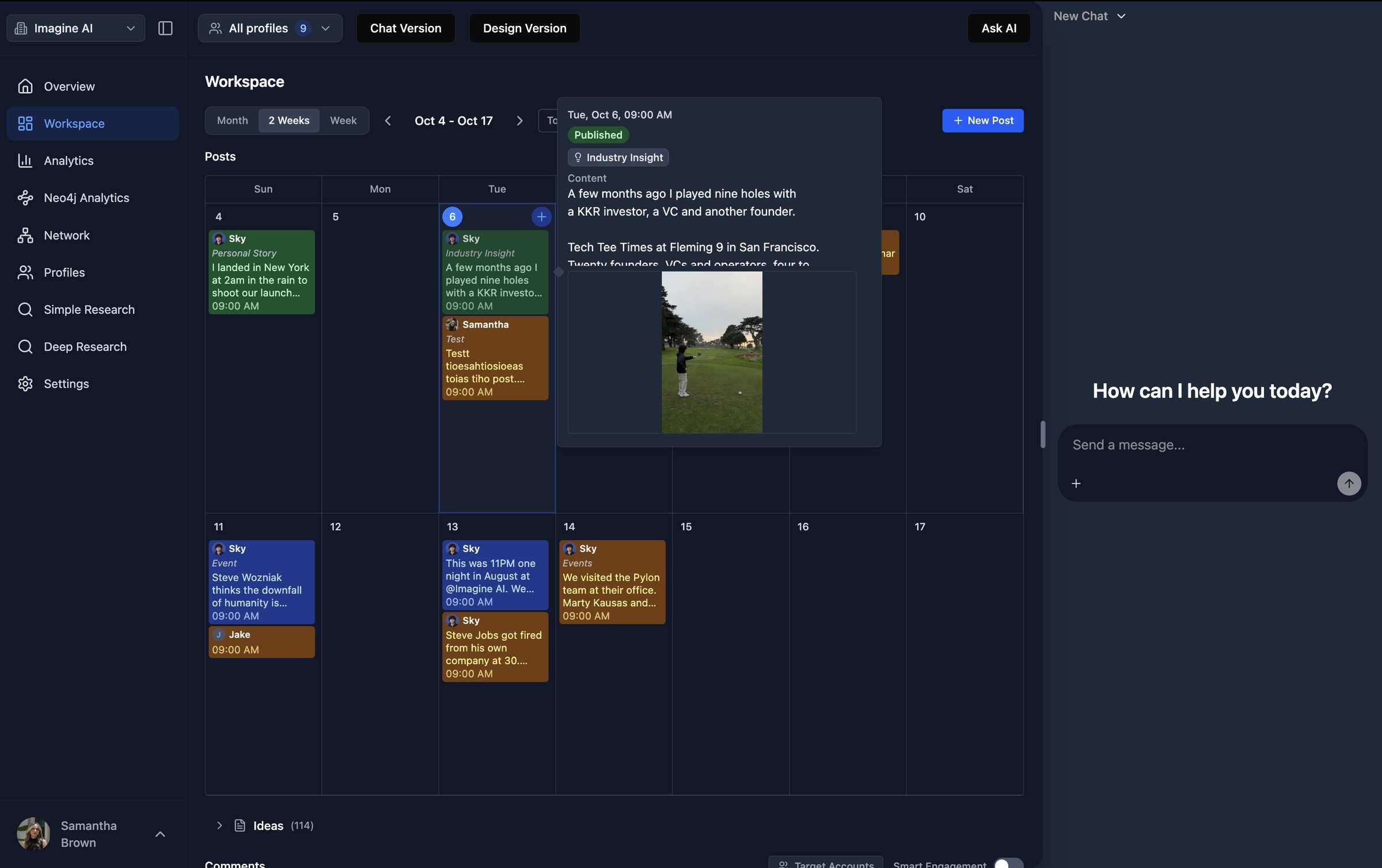
 BeforeAfter
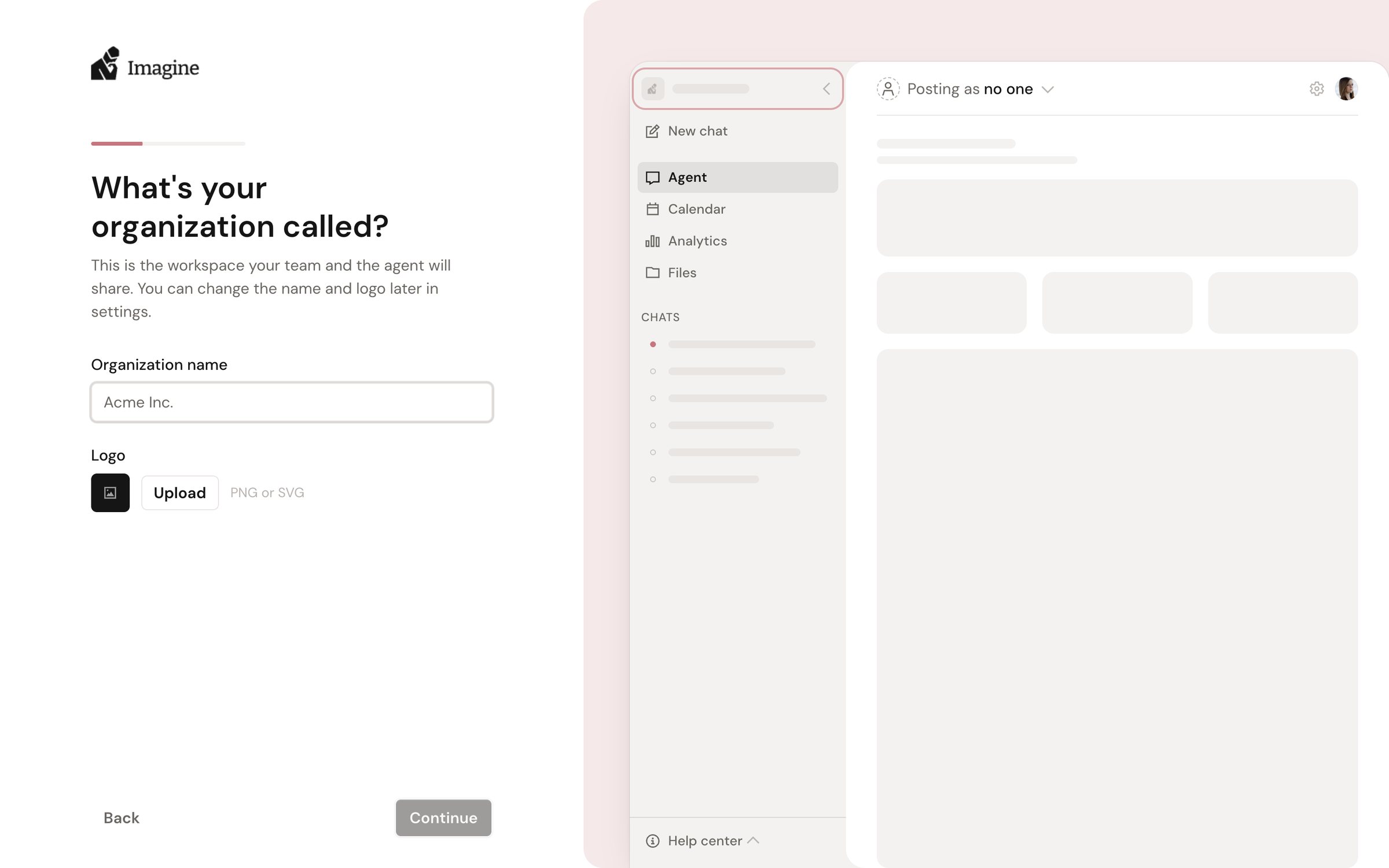
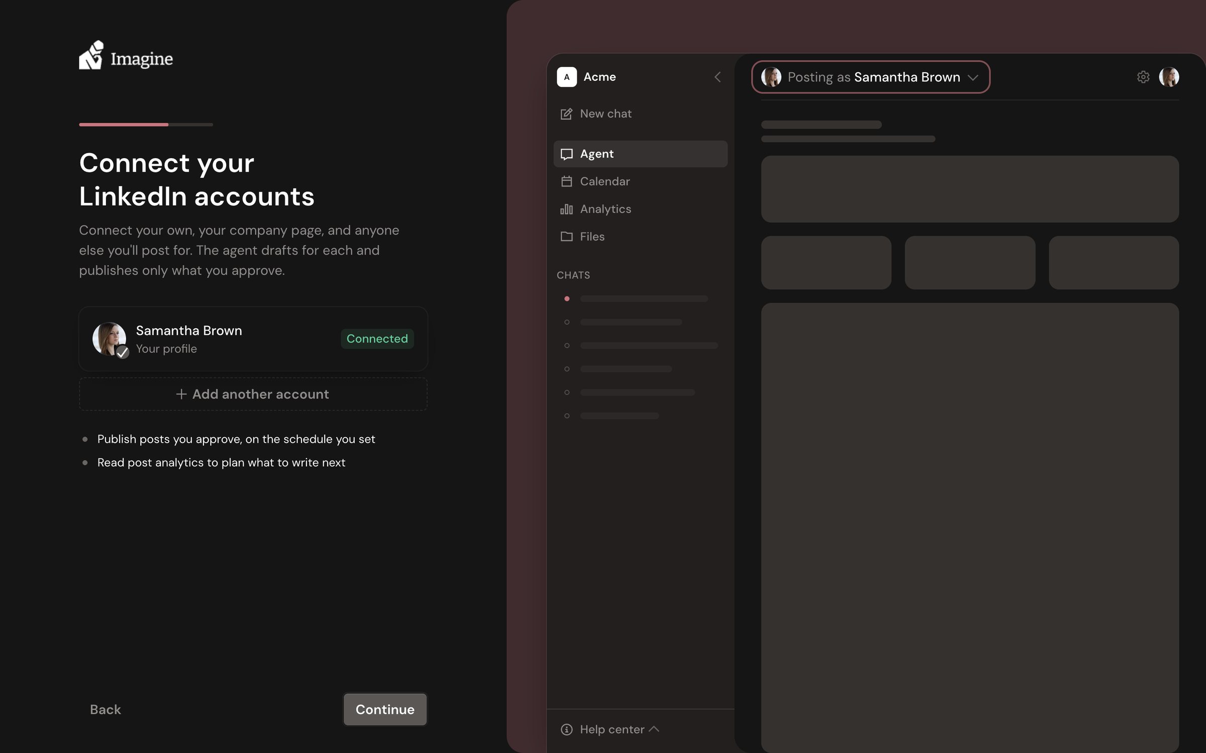
The old app had one setup screen: name an organization or paste an invite code. After that it dropped you on a dashboard of zeros, and everything that actually made the product work, inviting teammates and connecting LinkedIn, was left for you to find in Settings and Profiles on your own.
The new onboarding is a guided six-step flow. Each step does one thing, and a live preview of the workspace builds itself on the right as you go, so by the time you land on the agent it already knows your org, your team, and who it posts for.
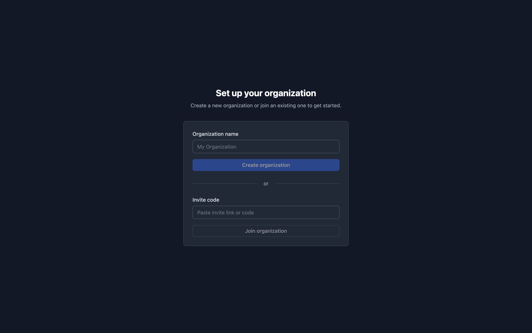
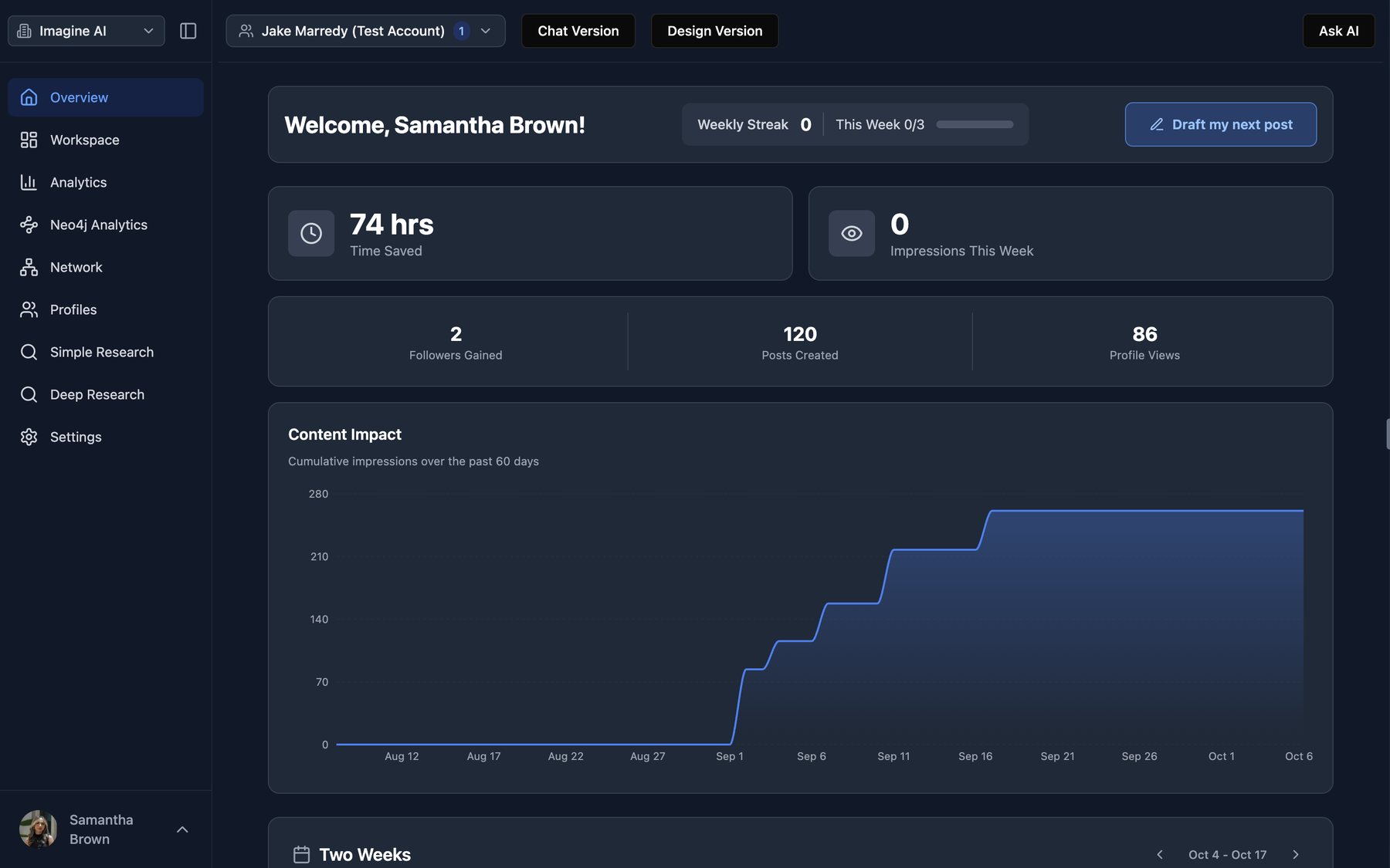
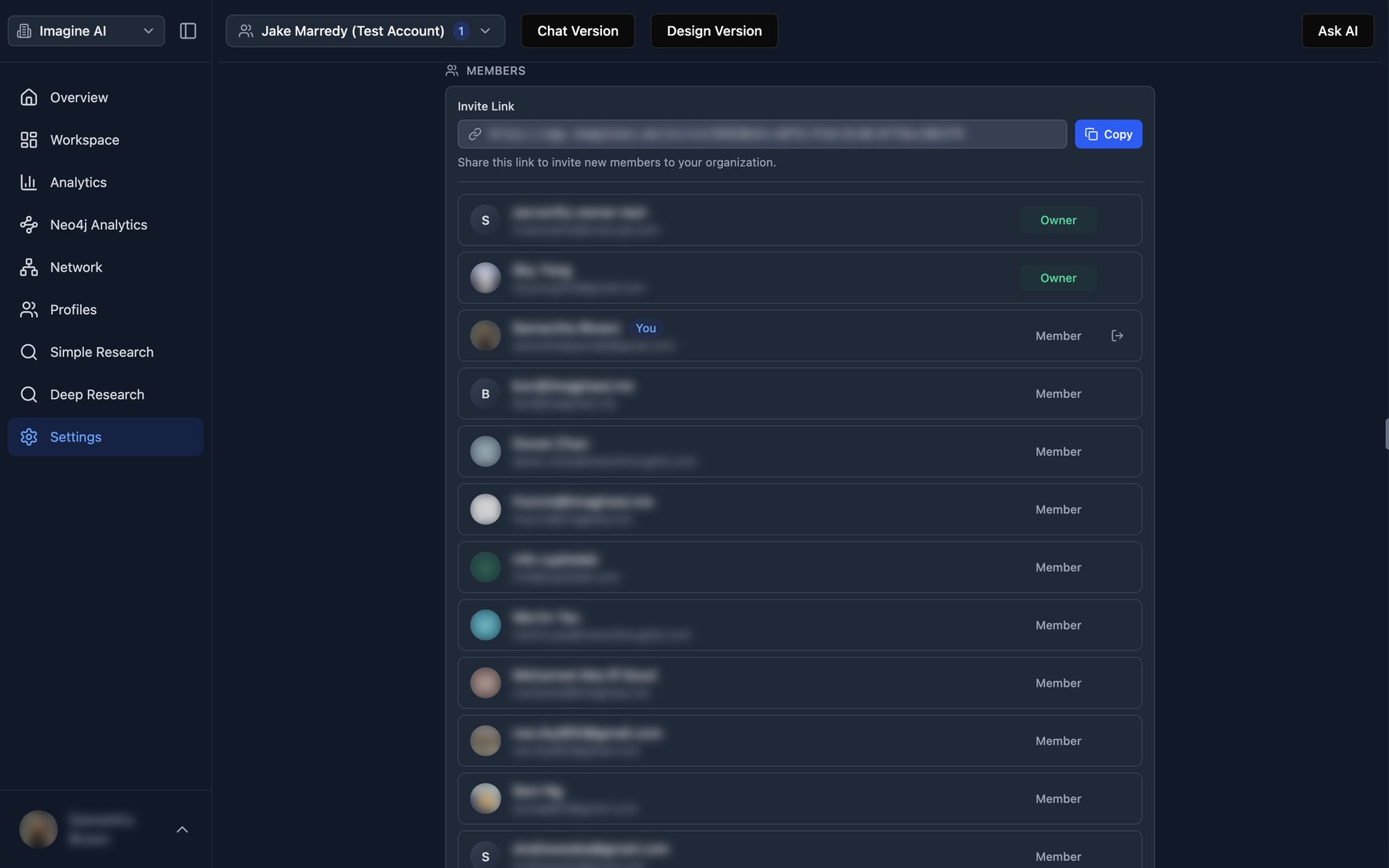
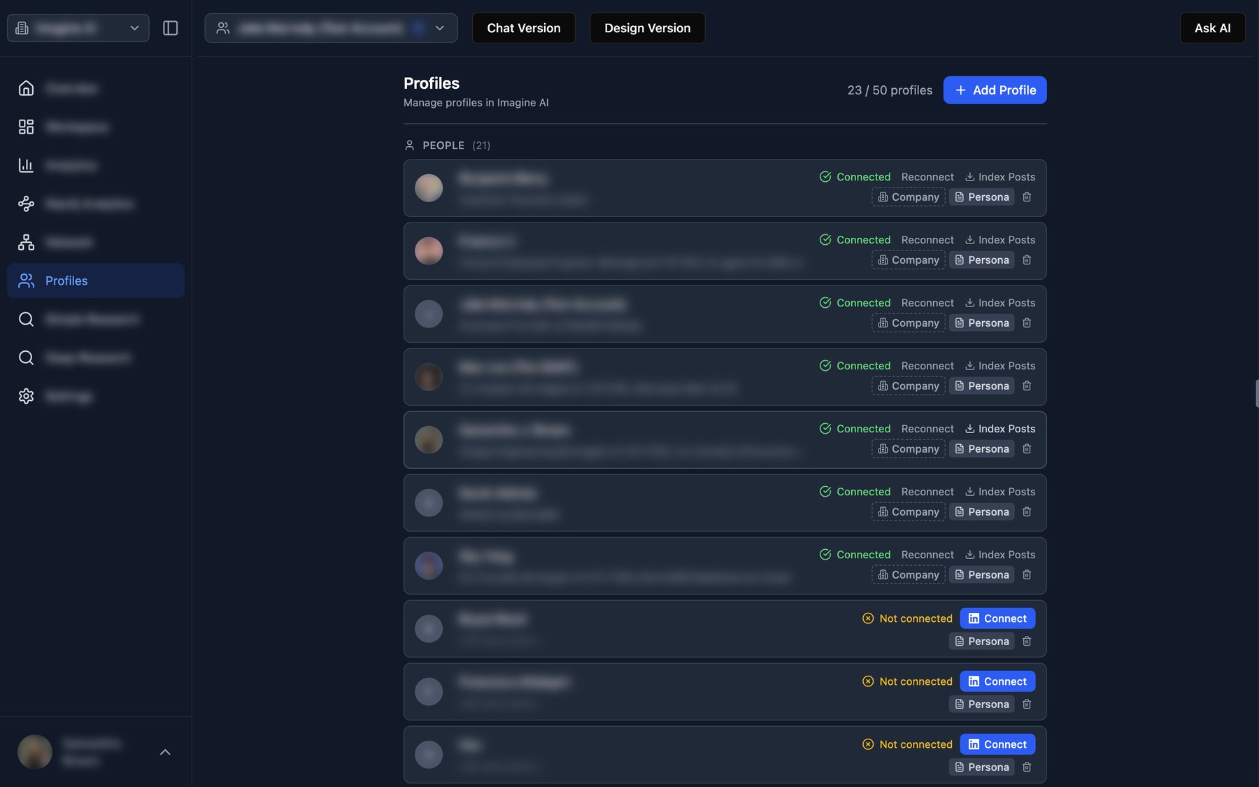
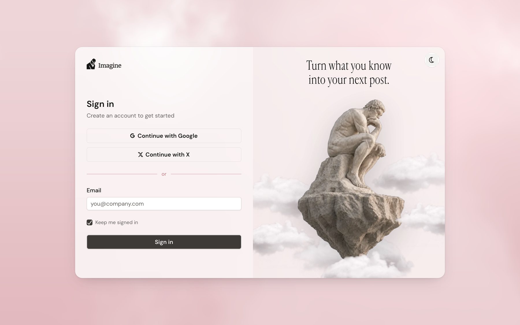
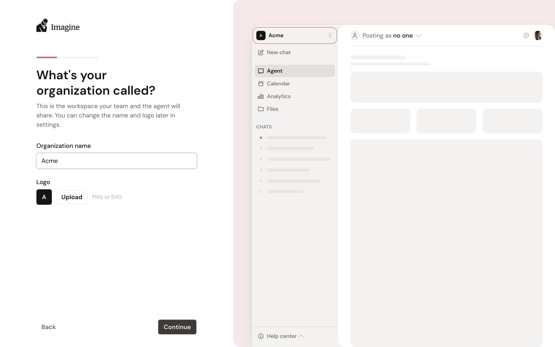
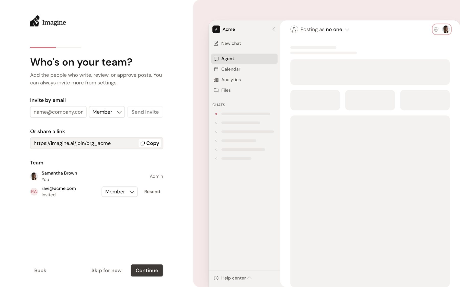
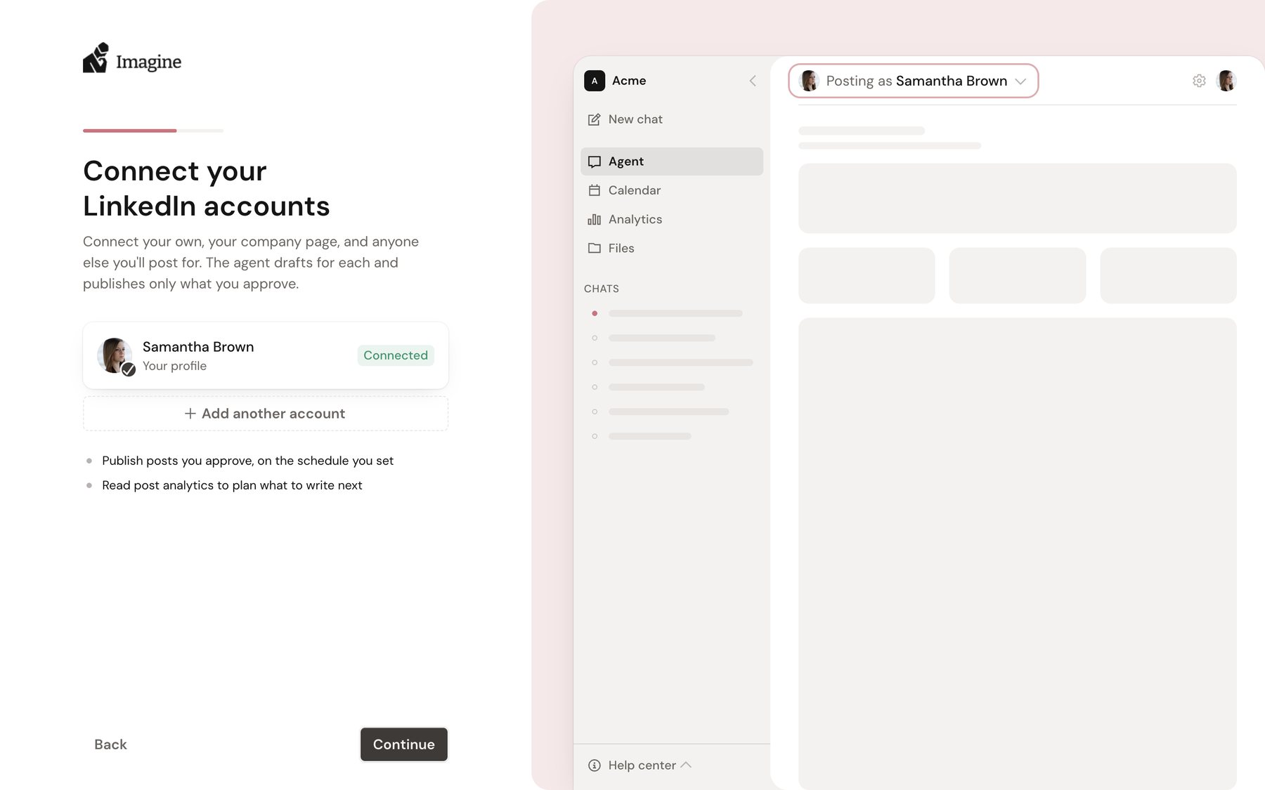
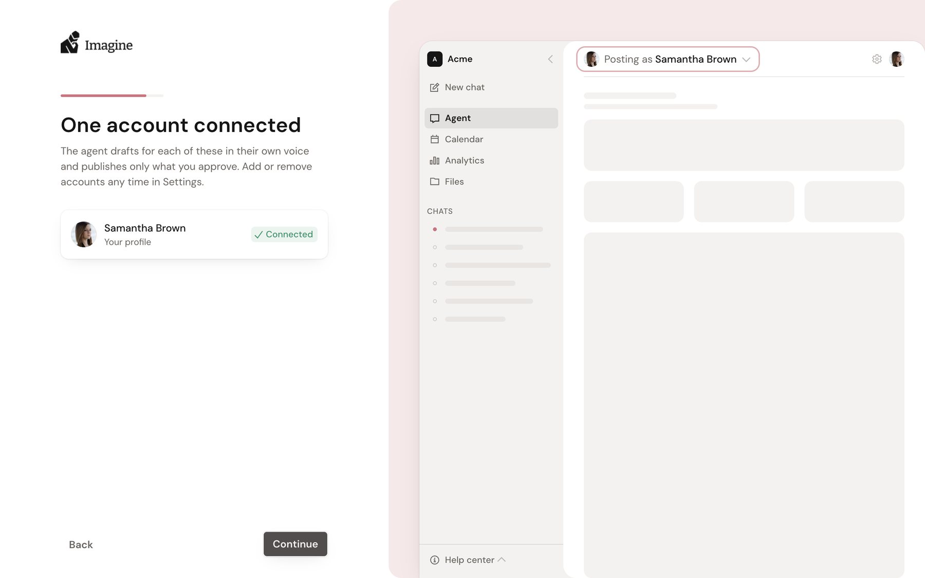
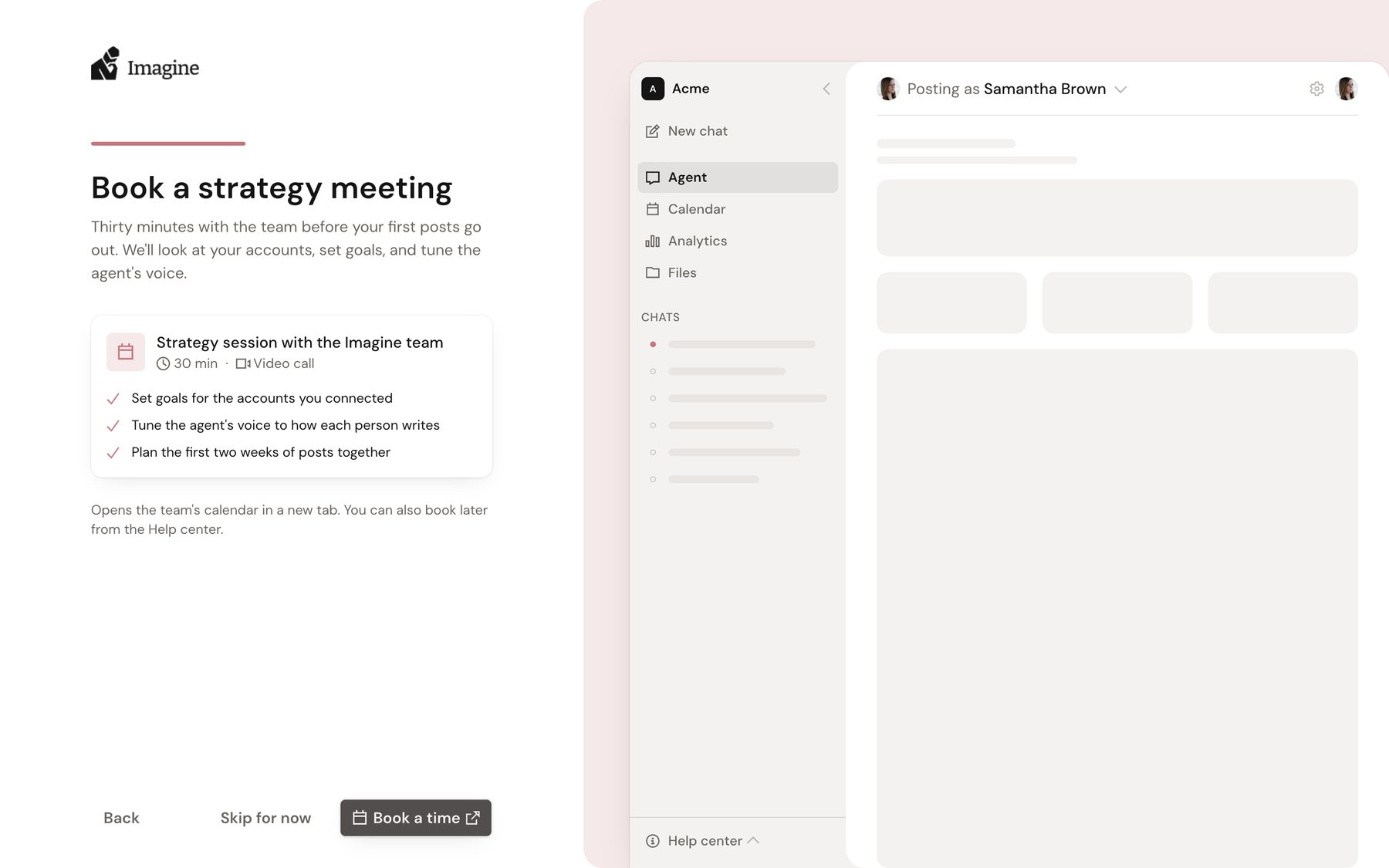
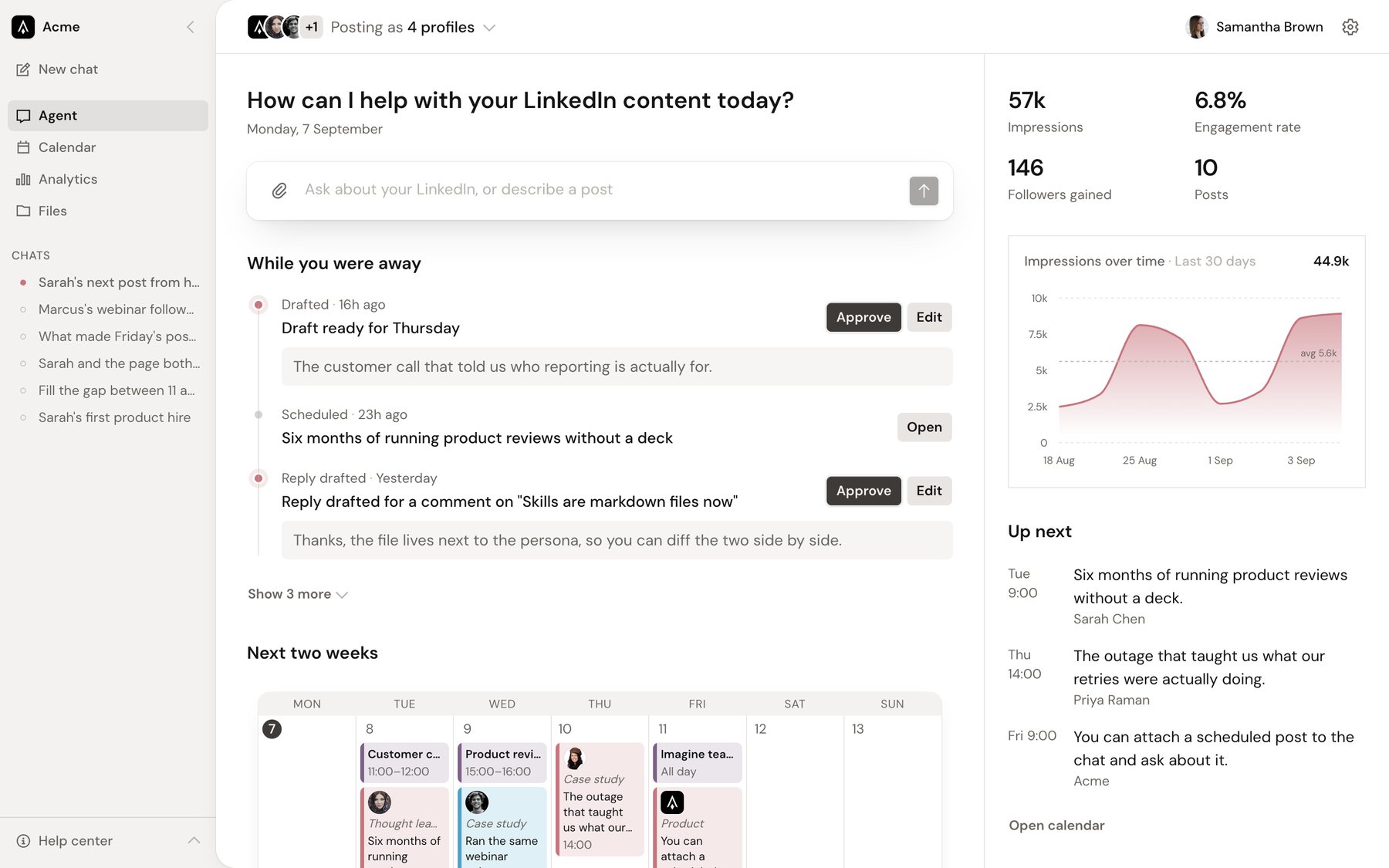
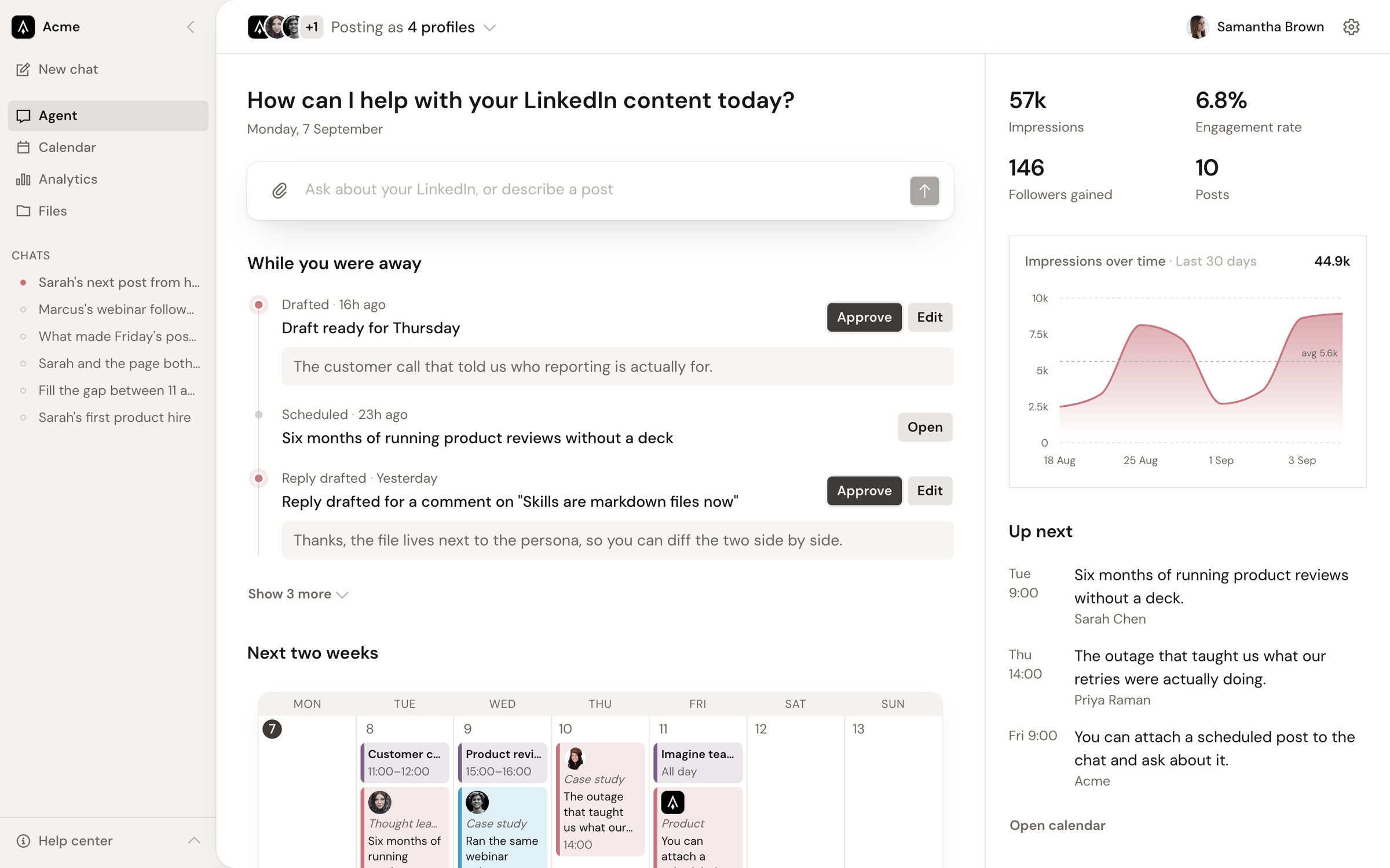
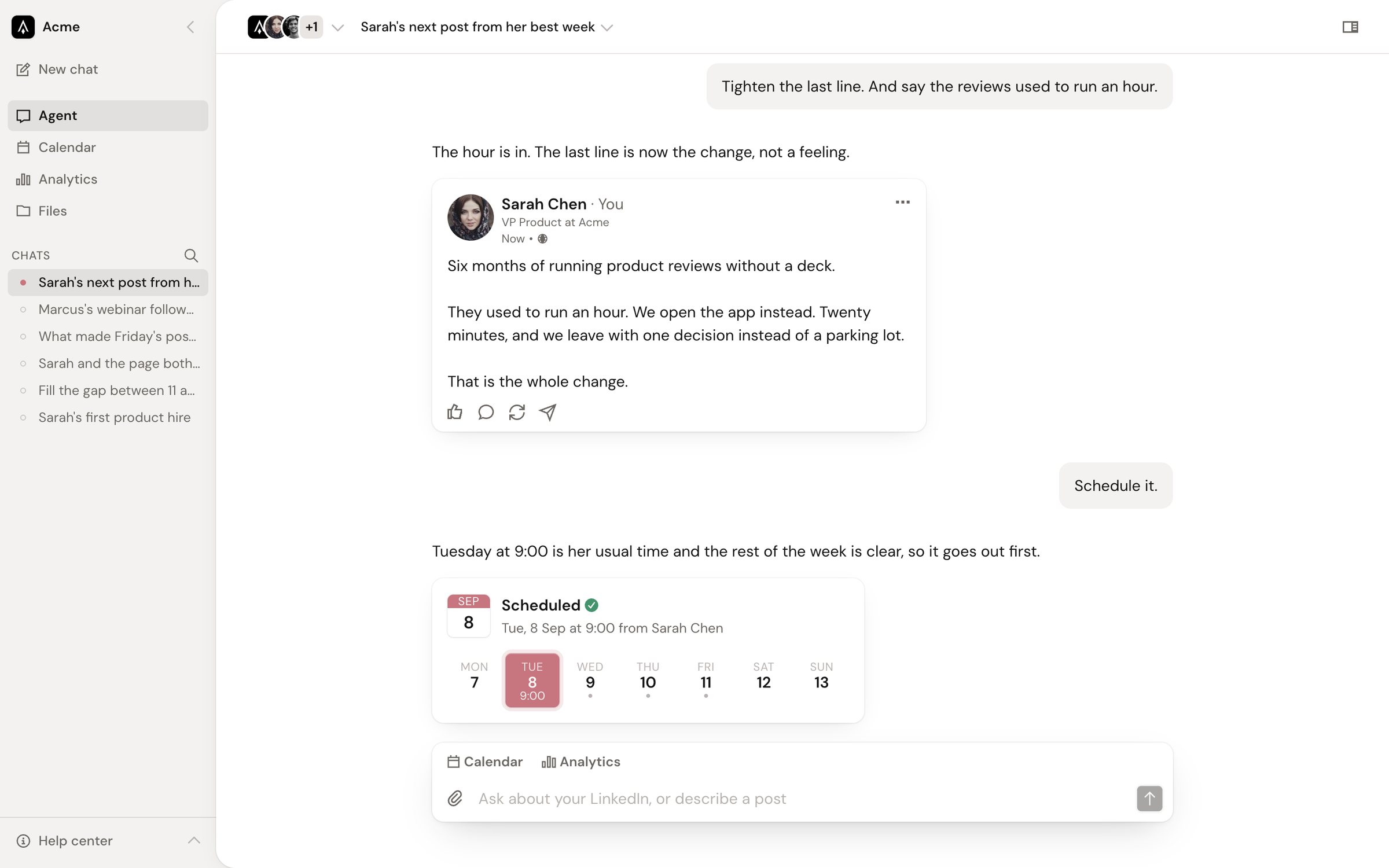
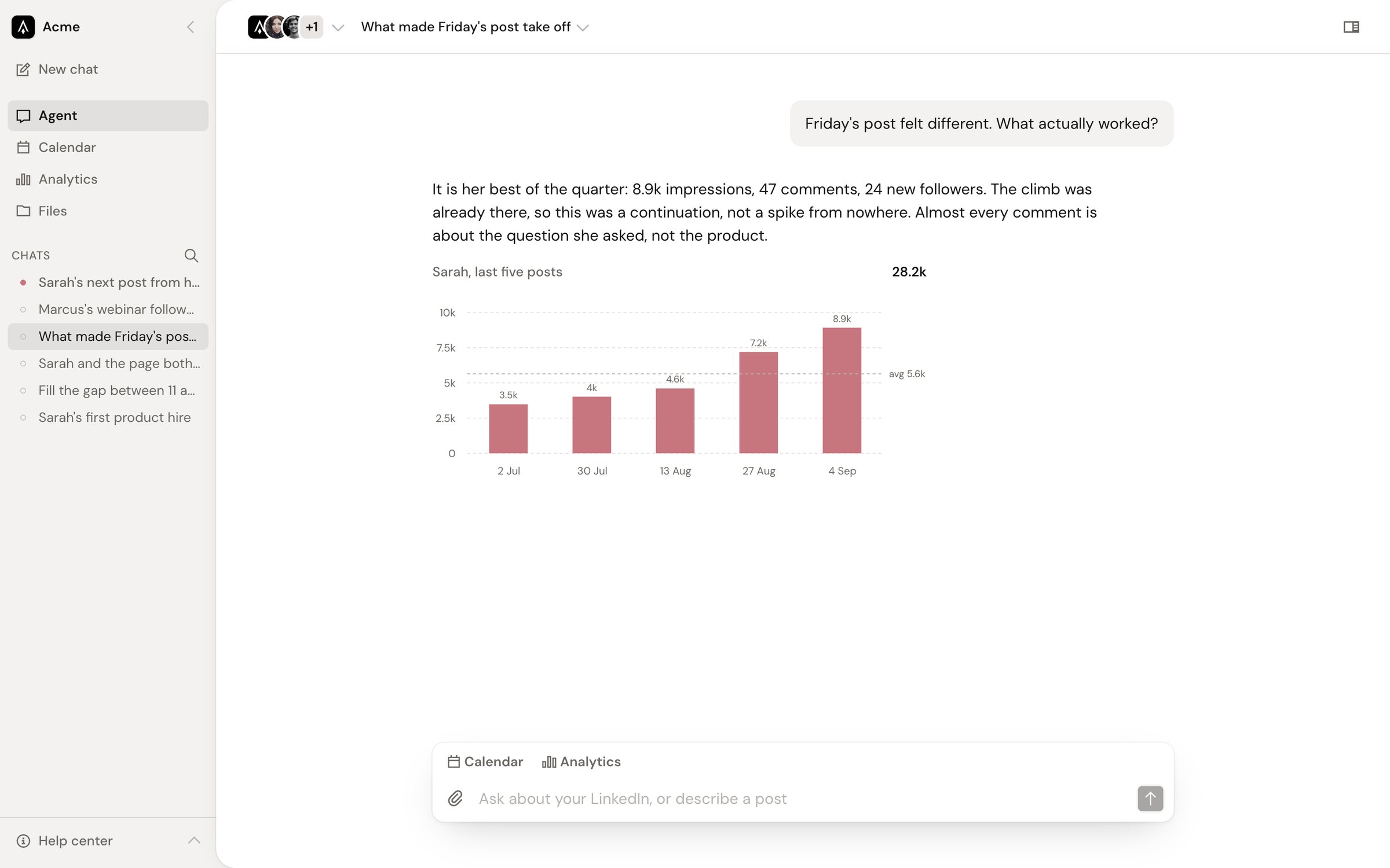
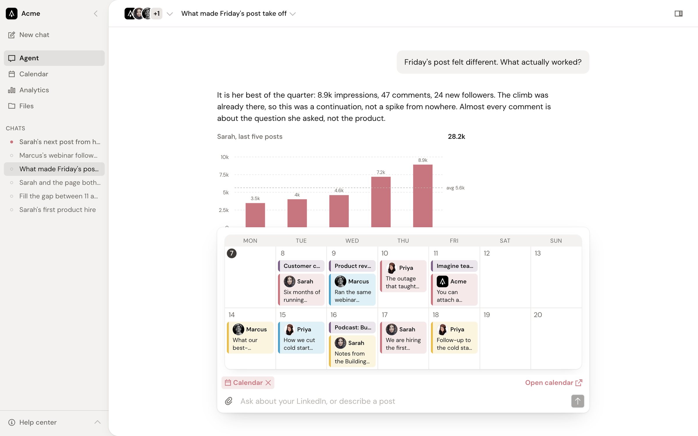
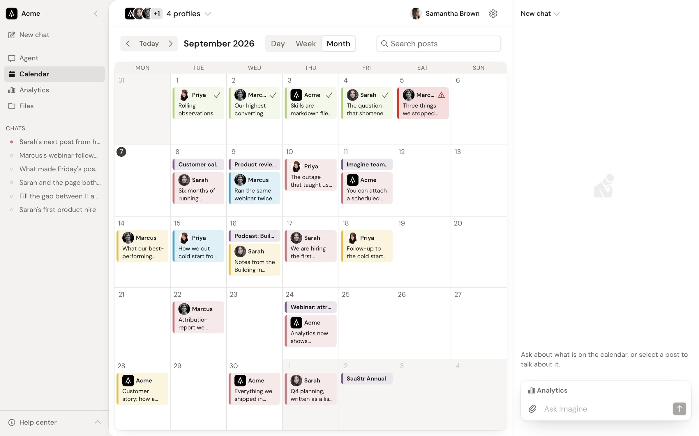
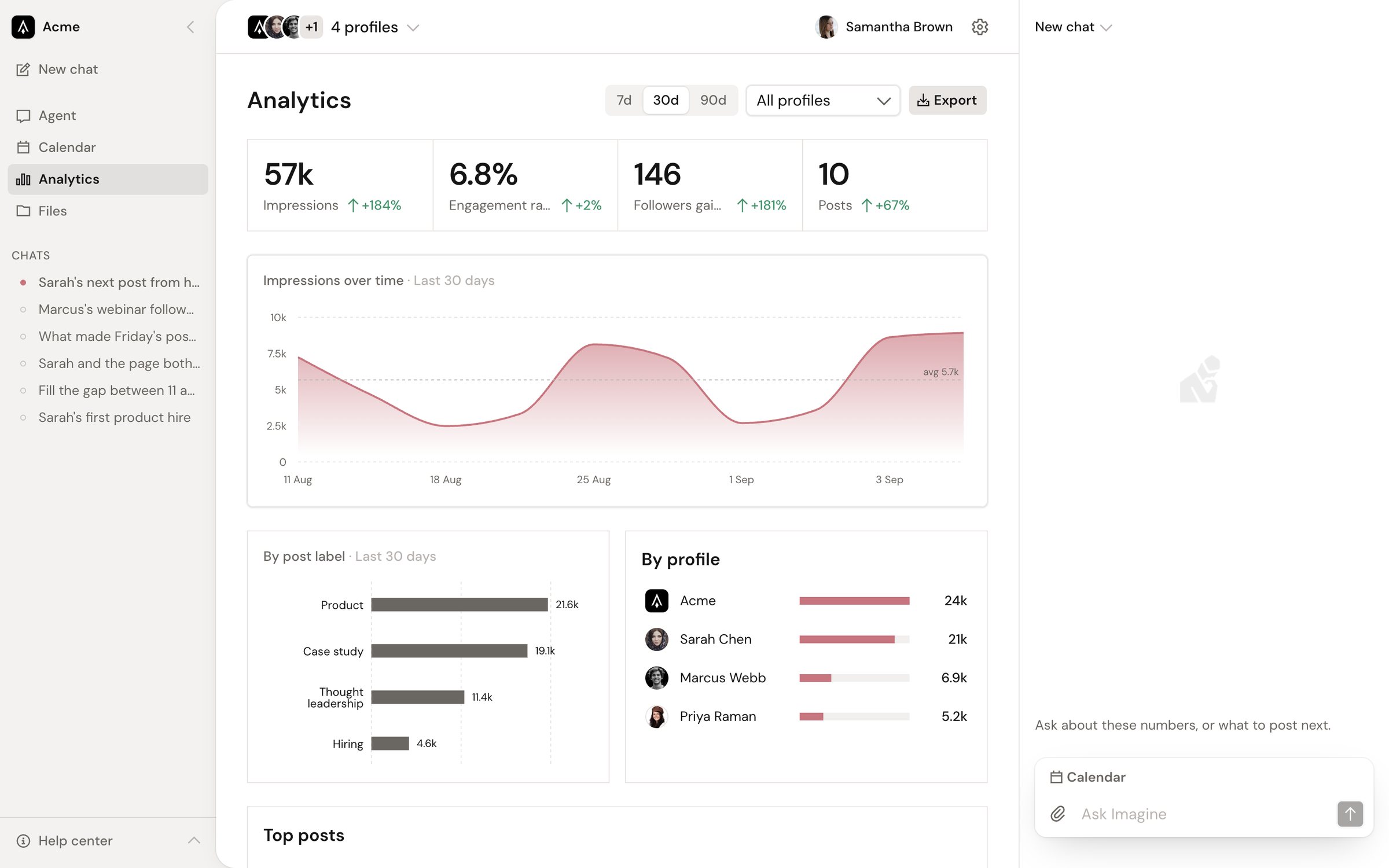
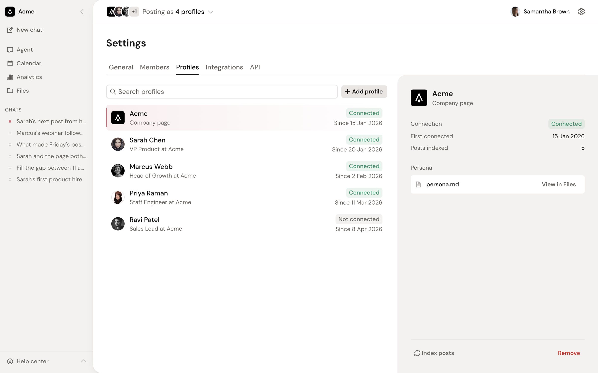
Both themes resolve from the same tokens through a single switch, so dark mode shipped with every screen rather than as a follow-up.
I built it, too
I implemented the redesign myself in Next.js, TypeScript, Tailwind CSS v4, shadcn/ui, and Motion, on one mock data file shaped exactly like the production Postgres schema. Then I ported it into Imagine's production app through a series of pull requests, and fixed the structure underneath the old UI as I went.
- Pages were client components.14 of the old app's 30 pages and layouts started with “use client”. The whole screen shipped to the browser, mounted empty, and then fetched its own data, so every page loaded in two steps.
- Where you are lived in query parameters.The current organization and the selected LinkedIn profiles were read from
?orgId=and&clientIds=on the client, mirrored into localStorage, and resolved through a 345-line organizations context. Next.js only passes query parameters to pages, never to layouts, so the app shell could not know which org it was in on the server, and every link had to carry both IDs forward by hand.
/overview?orgId=95028e5e-…&clientIds=2d526628-…
/tasks?orgId=95028e5e-…&clientIds=2d526628-…
/analytics?orgId=95028e5e-…&clientIds=2d526628-…/v2/[orgId]/agent
/v2/[orgId]/calendar?view=month&date=2026-09-01
/v2/[orgId]/calendar/post/[postId]
/v2/[orgId]/memory/[[...path]]- The org moved into the path.
/v2/[orgId]replaced?orgId=. The workspace layout is now an async Server Component that reads the org from params, checks membership once per request, redirects non-members, and passes the org and user down as props. Switching orgs is a link. - Server first, client islands only.Every v2 page and layout is a Server Component. Client code is limited to leaf islands that need the browser: collapse, sheets, forms, motion, and the chat runtime. None of them fetch on mount.
- State the server can read.The calendar range lives in
?view=&date=so the server fetches exactly that window, and each post opens at its own route with tabs kept in the calendar layout. Links replace setState calls that rewrote query strings. - I held my own prototype to the same bar.The redesign was built fast, so I didn't copy it as-is. Its 690-line sidebar, driven by eleven props, became compound parts that read the route and collapse state from context, and its rows became real links that prefetch and open in a new tab. Mock providers that only let a screen pretend to save were replaced by entity server actions, and animation code that could never run under the app's motion setup was deleted.
- A port, not a rewrite.I upgraded the platform first (Tailwind CSS v4, React 19), moved the old UI under its own route group so it kept serving production, and landed v2 beside it screen by screen: the workspace shell, settings, a real-time calendar editor on Liveblocks, the agent chat on the existing assistant-ui runtime, and Memory on the workspace filesystem SDK.